Hailey: Elwin, I think we’ve both been doing a pretty great job with these makeovers. Wouldn’t you agree?
Elwin: Sure. Yes. Definitely.
Hailey: You seem a bit…distracted. Could it be that today’s design has left you rattled?
Elwin: No! No! My design was great. IS great.
Hailey: Have you seen my design?
Elwin: Yes. Let’s not talk about it. Let’s just show what we’ve done and let our fans decide whose is better.
Hailey: I knew it! You DO think mine is better!
Elwin: First, let’s see the original Tournament Arena lobby:

Hailey: Wow. It’s very bright, don’t you think? And there’s so much stuff in there. If I was a competitor, this would NOT make me feel relaxed and ready for my game. And look at all the junk food they’re serving.
Elwin: Er, yes. I didn’t mind it that much, actually. Lots of color, lots to look at. Anyway, here’s my design:
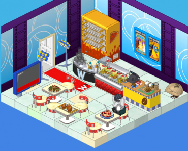
Elwin: I tried to incorporate some blue – very restful color, you know. And I’ve added a pizza oven (the manager of the arena wanted another way to earn KinzCash, so I suggested selling pizza. He thought it was a great idea!). The tables are great for sitting at and watching the tournaments (on TV). And the lights will make everyone feel like a superstar when they arrive.
Hailey: Very nice! Now here’s my design:
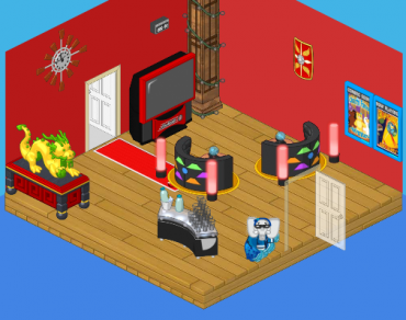
Hailey: I went with a more upscale, modern look. I wanted competitors to feel excited to be there (hence the red) and to have some healthy snacks to eat (goodbye fast food counter). I added the dragon for luck and inspiration, and the booths make great places to sit and discuss strategy with a friend.
What do you think, reader? Which elephant has created the better design? Leave your thoughts in the comments below!







idk about this 1 Elwin’s is a littlle to cramped and not very matching. Haliey’s is kind of boring and not a lot of stuff to do. But I would have to choose elwin.