Have you designed a room using items from the Stripes room theme? Before these items arrived in the WShop, the artists played around with color and design before deciding what the final pieces should look like. Here’s a look at the concepts for 3 pieces of furniture from the theme:
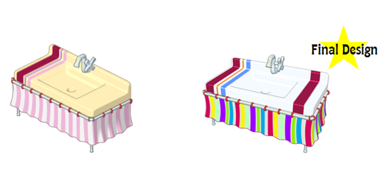
Striped Kitchen Sink
The final design of the Striped Kitchen Sink is much more colorful than the concept. The ivory white top really makes the colors stand out:
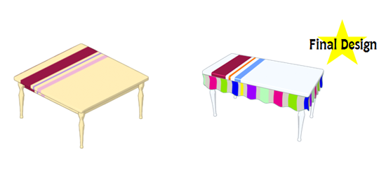
Striped Dining Table
The shape of the Striped Dining Table was changed from a square to a rectangle. The colors were also updated and a trim was added to match the Striped Kitchen Sink:
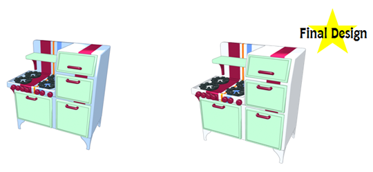
Serving Stripes Stove
Only a minor color adjustment was made to the Serving Stripes Stove. You can see that the color of this stove was changed from blue to white:
The Stripes room theme is now available in the WShop! What do you think about this theme? Do you think we made the right color choice? Leave your comments below…




Not really crazy about it.
I agree its not really creative
I think I like the original better for all three. :|
Me too :( Oh well, I can’t buy half the theme anyways since I’m not Deluxe. ~Ocean
I think you made the right color choices! the only thing , in my opinion , is that I wish the dining table was still square but would have the colors of the rectangle one. anyway…
Me too!
I like it but it does seem kind of mismatched
Yeah, the sofa, chair and TV don’t match the kitchen items, for instance…
I like the final designs the best!
i LOVE the pink sink
I honestly love the stripes theme but I look at these and prefer the before choices.
so do i
Me too, it’s less POW I guess. :D ~Ocean
I agree, I like the before choices because it kind of hurts my eyes looking at something so bright, let alone having a whole room of that design! I do really love the stripes theme A LOT, though.
I like the newer ones cuz they r brighter and i love bright colors! :)
I agree with you, socialred !!! :) I LOVE bright colors too! (I have that theme! Does anyone else have it…?)
Sorry for not replying but I guess it might be because I love pastel and am not into bright stuff (because of neon) but I still love the theme and have an entire room for it.
I really Like this theme. its so Colorful! Also, I think you guys made a Great Color Choice.
It would be awesome if they didn’t cost eStore points. :(
I agree but I’m not Deluxe so I can’t buy half the theme.
Yes definitely…Much better color…
AWESOME!!!!!! :o :) ;) :D :P um… How do you do the blushing one?
Great job Ganz! I like the final designs…but I do like both art designs for the stove! :)
Yeah!