Have you designed a room using items from the Stripes room theme? Before these items arrived in the WShop, the artists played around with color and design before deciding what the final pieces should look like. Here’s a look at the concepts for 3 pieces of furniture from the theme:
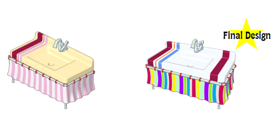
Striped Kitchen Sink
The final design of the Striped Kitchen Sink is much more colorful than the concept. The ivory white top really makes the colors stand out:
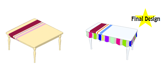
Striped Dining Table
The shape of the Striped Dining Table was changed from a square to a rectangle. The colors were also updated and a trim was added to match the Striped Kitchen Sink:
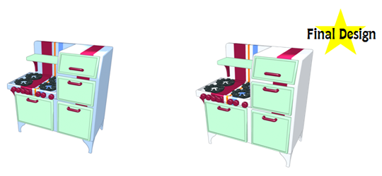
Serving Stripes Stove
Only a minor color adjustment was made to the Serving Stripes Stove. You can see that the color of this stove was changed from blue to white:
The Stripes room theme is now available in the WShop! What do you think about this theme? Do you think we made the right color choice? Leave your comments below…





the 1st for sink and stove is sooooooooooooooo cuuuuuttttteeeeeeeeee!!!!!!!!!!!!!!!!!!!!!! i wish those were the final design :) :) :) first comment :)
I love this theme!!!!
In some of these I like the first design, but great job with the finished product Ganz!
well you should maybe make a new theme maybe if you have time an fish trigger theme or alien theme thats my idea
I like all of the final designs better than the first designs. They are much more colorful! I have the stripes room theme and it is one of my favorite room designs!
I personally hate this theme ~1144334
love it
The colors are really pretty and the stripes dining table concept sketch looks like the simple stripes side table
I like the white colorings with stripes better than the tan with stripes, so ya, I think you made the right color choice.
I like the final sink idea and final table idea, but the first stove idea (the one with blue) was better, in my opinion.