Have you designed a room using items from the Stripes room theme? Before these items arrived in the WShop, the artists played around with color and design before deciding what the final pieces should look like. Here’s a look at the concepts for 3 pieces of furniture from the theme:
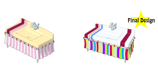
Striped Kitchen Sink
The final design of the Striped Kitchen Sink is much more colorful than the concept. The ivory white top really makes the colors stand out:
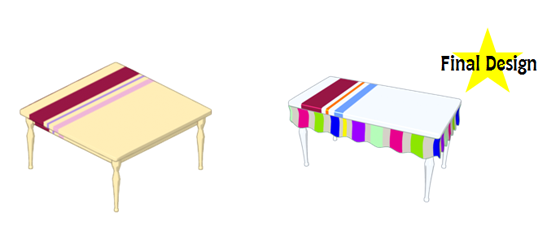
Striped Dining Table
The shape of the Striped Dining Table was changed from a square to a rectangle. The colors were also updated and a trim was added to match the Striped Kitchen Sink:
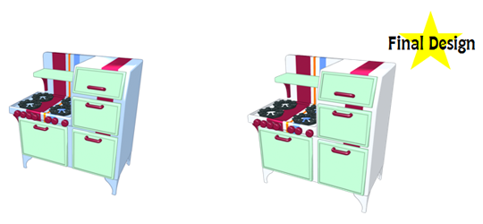
Serving Stripes Stove
Only a minor color adjustment was made to the Serving Stripes Stove. You can see that the color of this stove was changed from blue to white:
The Stripes room theme is now available in the WShop! What do you think about this theme? Do you think we made the right color choice? Leave your comments below…




I like the pink design better.
I like the ivory & pink colors better, than the deeper color, the artish here should of stayed a way from the darker colors, red and purple too sharp of colors with the white back drop….
Love the theme! It’s a bit offbeat, but very tasteful :)
YAY! First comment! I think the final designs are awesome! Will you make more furniture for the stripes theme, webkinz?
some unusual colors. i’m undecided so far. at least it’s different.
hey,webkinz could u make a webkinz fam. poodle?? its whight and light pink its psi is a brodway stage and its psf is a stage light soup!!! hope u like it! :) :0
I like some of the pieces of this theme, but I don’t like that the pieces don’t seem to match. The wallpaper clashes with the floor, the living room set clashes with the kitchen set……great separate pieces, but not so great together.
It would have been better if they had changed the other furniture to white too
#good choices love the picks they made other than the kitchen sink :)
I love this theme! Great job Ganz!