As part of our ongoing efforts to convert the web version of Webkinz.com over to our Webkinz mobile app, we are also taking the opportunity to refresh some of the older graphics.
Our latest update has arrived in the Webkinz Arcade with a fresh NEW look for the classic Cash Cow game!
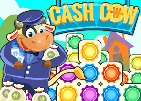
The new version works just like the old one—click on groups of colored bottles to clear them and earn KinzCash for you and Mr. Moo!
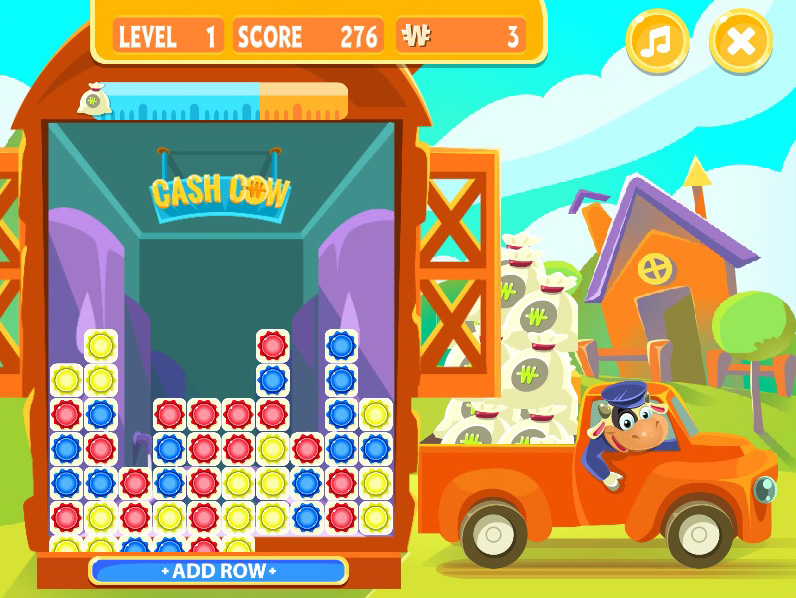
Click on a group of 10 orange bottles or more to win the Cash Cow Trophy!

This new version of Cash Cow will be coming very soon to the arcade on the Webkinz mobile app (available to download FREE at the Google Play Store or the Apple App Store)! Stay tuned to Webkinz Newz for all the latest updates!

Still want to play the old version of Cash Cow? You still can in the Tournament Arena!
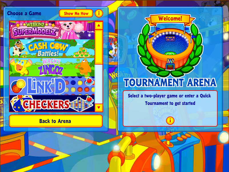
You can play Cash Cow Battles in both the Two-Player Games and Quick Tournaments section—a great way to earn some extra KinzCash!
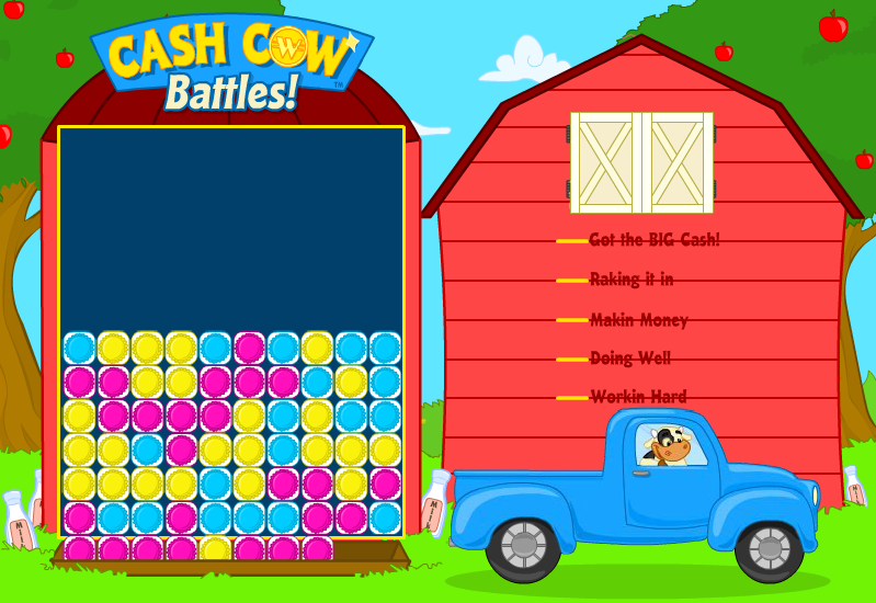
What do YOU think of the NEW look for Cash Cow? Let us know in the comments below.






I sort of of like it…i liked the old one better though because it looked more farmy than the new one! Isn’t the point of cash cow suppose to have a farm look?? I have been on wekbinz for 6 years (this is my 7) and i always wondered if they would change a game…but this is not what i expected…i just hope the old one still is the best!!
Sorry, for the last sent. i meant i hope u guys still think it is the best!!
This is my 8th year with my webkinz account! (But at times I stopped for long periods, but I still have my old one! It’s my favorite game now!) And also, I agree that it should look more farmy! (And, it, well, kinda hurts my eyes looking at it.) :(
lol
Hey bubbaskua can we be friends on webkinz?? My username is kramos04!!
As I said, I hate the new version, but beside the fact I have memories with the old one, I finally understood why I hate it so much. First, in the old one the actual playing background was a nice unicolor dark blue where you could see your moves, the new one is a mess; the old game background was formed by straight lines and solid simple colors without irritating shadows, in the new one lines are curved, secondary colors are used and too many shadows as well. And in the end, the old one was based on blue and green, calming colors, new one is a colorful orange and red mess which don’t let you focus.
THIS WAS ONCE MY “GO TO” GAME–WILL MISS IT & HOPE ONE DAY THE OLD WILL AGAIN REIGN <3 W love, k.
I sort of like it. It is a little bit TOO bright, but I can get used to that.
I so agree with the 6 comments that are showing on the current page. Another game ruined by graphics and lots of others ruined by Never Ever being able to win at all as we were able to several years back. Kids don’t like the looks and they aren’t happy that they never win anything. Not just older people issues.
I agree, I really liked the other one better!
Perhaps your younger coders could be given a seminar on colour choices and how it affects an older client base. Or get glasses to help simulate what it is like to play as an older person.
I have to say the same I thought I was the only one but I have glasses on for reading and yes it is to hard to see for me now hurts my eyes can cause eye strain will have to pass on one of my old favorite games now have noticed some things on weekend has changed color wise will have to watch that cause of eye strain. I already limit my computer time now.
SWEEEEEEEEEEEEEET!
But it hurts my eyes a little bit. I liked the older one better. =)
Well, I agree with the others. i don’t like the never version at all. Have been playing it this afternoon and it’s awful on the eyes. Add a line is cool, but please go back to the old graphics. No fun now.
Add a line was always there, it just wasn’t labelled. As for the new version, no. So much no. It hurts. No way I can play that. And that line about ‘refreshing older graphics” plural? That sounds like a threat. Two games have already been ruined beyond redemption. ugh
Hmmmm, interesting on the add row. I never saw it either on the old version, which I much much much prefer.
Man, I never saw the add row – darn, I’d have used it too. Thanks for the info.
I don’t agree I think it looks more kid like. The graphics are pretty OK and I still think it’s fun.
I never saw it either, Marius8853. Just for information, where was it? I’m looking at the above screen shot of the old version and I sure don’t see it. That’s what I’ve seen all along. Sure would have been handy – that is the only thing I like on the new version. Thanks for the info.
In the row that was the “loading” area on the very bottom was also the add a row section.
thanks so much for the info. Never knew it was there – guess just never clicked on it. But hoping they’ll go back to the old graphics and now we know it’s there.
Me neither.
I never saw that either on the old version. I’m playing it in the tournament area now with the old graphics. Found the add line on tournament version – never knew it was there either. Cool.
The colors are harsh on the eyes. Too bright.