By Wiggles Pig
My clients were so happy with the living room I designed for them they came back and asked if I could work my magic on their kitchen. I managed to convince them to spend a little more this time around – after all, kitchens have some big ticket items. A fridge and stove can eat up most of your budget if you’re not careful.
So, with $3,000 burning a hole in my pocket, (okay – so maybe I went the teensiest bit over budget) I designed a kitchen in which the impact came from the contrasting colors – not from my clients’ pocketbook.
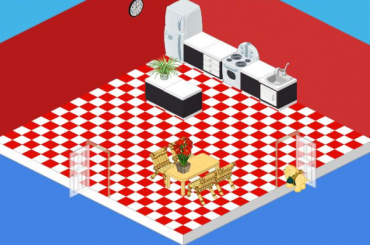
I began with a standard white fridge and stove. You can’t go wrong with the classics and at just $500 and $600, the price was right. With white appliances as my starting point I used red and black to create a sense of drama. Red and white tiled flooring combined with red painted walls make a bold statement. I then selected the Chic cupboards and sink. The black base and white countertop of my counters and island were a stark contrast against the red.
For my table and chair I didn’t want to detract from the effect I had created with my black, white and red theme, so I went with a simple Polished Oak Table. The Bamboo Study Chair may not have been designed for the kitchen, but when you’re working on a budget you’ve got to be creative. The chairs were a whimsical touch and picked up the color of the oak table and at $85 each they were a steal!
With a couple of plants (I love plants in a space!) and a simple Classroom Clock, my clients were eating their hearts out in their new kitchen.


I thought this was the room that needed made over! ooppss!!
i am upset i love your first and this is is well not to mean rude ugly
I think its OK, but they did a little bit better job in the bathroom. Not to be mean to GANZ, but this room needs a little more furniture and a darker shade of red if it has to be red. I do not want to be mean, but I am telling what I think. And I do have to say, they almost always do rooms that I like. I did think they did a GREAT job on the bathroom. but I think they should do some more work on the kitchen.
The room looks empty. I do like how some of the counters are separt from the rest though. I would have gotten chairs to match the table too.☺
red and gray
not pretty
needs more……………….pizazz
I have a kitchen that is very similar to this but mine looks a whole lot better.
I HAVE NOT SEEN YOUR HOUSE BUT I THINK I AGREE WITH U!
I used black and white flooring. This alone makes the room look better.
For real, get rid of the plants and use some milder colors. It hurts to look at. Then get a nicer stove and table and chairs.
I think it was the fridge that cost so much; so maybe it’ll cost 500 kc more but it’ll look so much better.
no affence but i dont like it
Sorry… but it hurts my eyes to look at it.
Also it’s much too empty and could use some windows or wall art.