Heya Webkinz Newz readers! You’ll never guess where I was the other day.
Give up?
I was at Dr. Quack’s Office! I had a terrible sore throat, and fortunately the good doctor was able to fix it (hooray for peanut lozenges!). Anyway, while I was there (in the waiting room, then in the exam room), I noticed something…the place was a design disaster! Not only did Dr. Q need some serious organization, his decorating looks like it’s at least thirty years old – seriously, what doctor’s office has brownish-orange walls? Fortunately, I happen to have an eye for design, so I offered my skills.

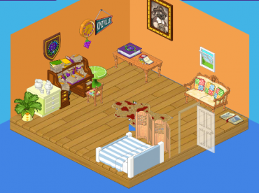
This is the ‘before’ picture – the walls aren’t a great color, Dr. Quack’s desk is a HUGE mess (hello, storage space) and there are too many random things on the wall. The worst offender of all, however, is the rug in the middle of the room. When I asked why Dr. Quack liked it, he said, “It’s eclectic!” I rolled it up and put it into storage.
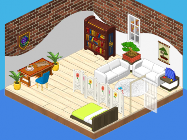
This is the after shot!

Note how clean and pretty everything looks! The walls are so modern and the floor is spotless. We’ve moved the books to a shelf, cleaned up the leftover papers, added a neat bonsai plant and a print (very relaxing for nervous ‘Kinz in the waiting room), a fun game to play while you wait, some plush couches and an up-to-date examination table. When Dr. Quack saw the new look, he had one thing to say: “Wow.”
Mission accomplished!


I do love interior designing and I do watch a lot of HDTV. So here is my take if you care -
I love the fact that you added more storage space and the floor and the wall did not match earlier. It was not pleasing to the eye.
Love the fact that you incorporated a game to room so that there is something to do between waiting periods.
But,
White on the doctors office floor (high traffic area) – makes cleaning harder.
I think the dual tone on the wall will make the room look smaller as it reduces ceiling height.
Wow, I like how you took it to a modern clean design. I LOVE designing so if anyone would like to see my rooms go to my page and check out Baxxers page and I am a girl but I have boy Webkinz.
WOW!
cool Haliy Iove the way you did the room!
I love the new room!
The second one is much better! It’s more . . . um, stylish. ‘Kinz will love Dr. Quack’s waiting room now!
O my gosh! That is a awsome makeover!!! I Want one!:)
LOVE IT!!! Wish my Webkinz room was as neat as that! :)
Love the new Doctor’s office!!! Spring means renewal and that means it’s time for me to start redecorating my room’s too!!!!
Gosh, no wonder my rooms look “tacky.” I thought Dr. Quack’s first office looked fine. I’ll admit, I have absolutely no sense when it comes to decorating. The only one of my rooms that is half-way decent is my Cave Room. I think I should just move in and stay there forever. I envy all you Webkinz-ers who decorate all those beautiful rooms I see on Webkinznewz. Keep up the good work because I love to see them. Regards, Apache
YUCK!