Hello Webkinz Newz readers, Ella McWoof here with a special report! We’re only days away from the much anticipated release of the new Party Time room theme. The theme will be available for KinzCash in the W-Shop on May 10th.
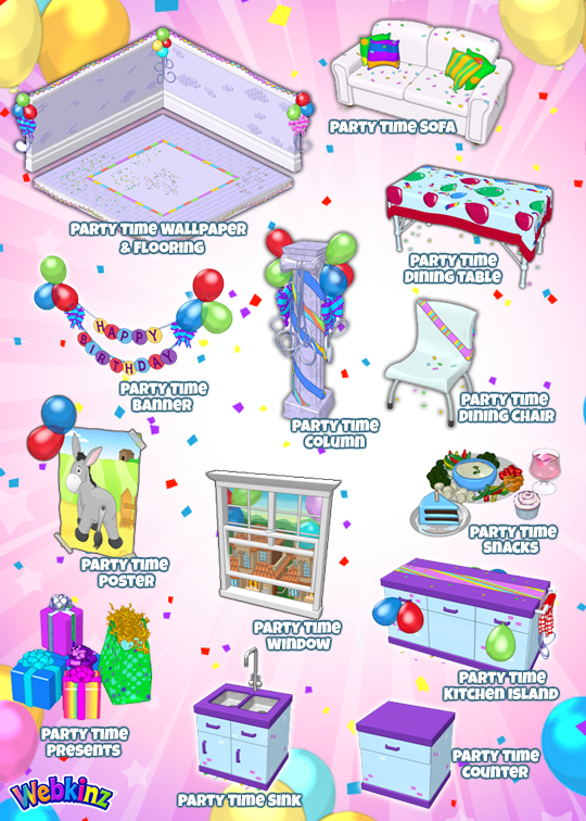
Thank you to everyone who submitted name suggestions for these items in the comments sections of my previous posts. Although each were taken into careful consideration, I have been informed that the names will each start with “Party Time” so they will be grouped together in your Dock. Several players requested this although, the Webkinz Newz community has proven once again how creative they can be when faced with a challenge!
In any case, here are the final names of each item that will be included in this theme:
As I have reported in the past, 3 existing W-Shop room themes will be retired to the Curio Shop when the Party Time room theme is released on May 10th. These items will still be available for purchase but, only from Arte’s Curio Shop, making them harder to find yet more valuable for those who already own some of the items.
Any last ideas as to which themes may be moving to the Curio Shop on May 10th? Please leave your comments in the section below.
This has been Ella McWoof reporting for Webkinz Newz…





Unfortunately the ones (the column, window and the kitchen island) that I really really want are for deluxe member only :’(
is it kinzcash
Ohh boy! Looks like one fun looking theme!
I wish that they had the streamers from the original concept drawings of the wallpaper available as a separate item that you could put on the wall. For me, when I saw the room on Podkinz with all the items, I thought the walls were too bland. It looked a bit like a sad party to me. But I really like everything else about this theme! Perhaps if the walls were a tad brighter. Not too bright to make everything overwhelming, but just to take the sad, empty tone out of it.
And I liked the blocks of purple in the original concept drawing of the floor. I think that pattern is seen in a lot of the other items, like the kitchen island, and it would’ve brought in a little more unity to the theme.