You voted that the Toadstool theme should be the next room theme to be released in Webkinz World. We’ve already shown you the first set of finished items in an earlier article here.
Now, here is a look at the second set of finished items, compared next to their concept drawings!
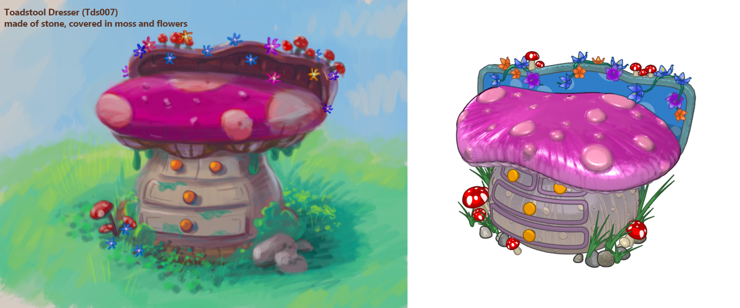
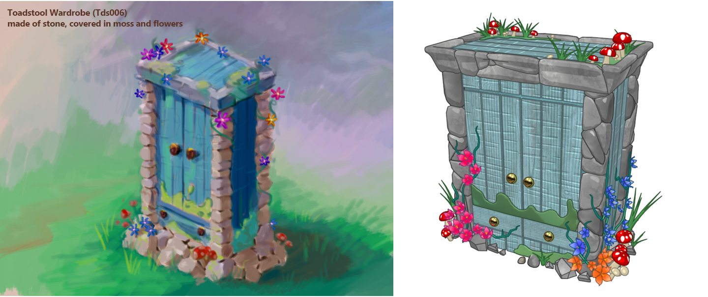
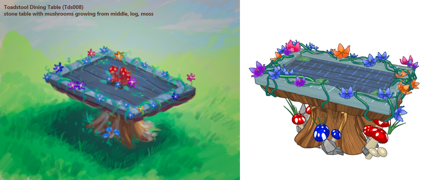
What do you think we should name these items? Let us know in the comments below!






very nice
on the toadstool dresser, i don’t care for the bright blue and bright pink/purple together. they’re too similar in value (light/dark). if one of them were a chunk lighter or darker than the other, it would look better. really like the wardrobe. :D thx, Ganz!
I like them, not love them, but I wish that they were more realistic and had more colour. I think that they should have added reds, whites, oranges, yellows and other bright, vivid colours to make it more like a happy theme instead of a mysterious theme. The current colours are nice, but the next wave of items could use a more diverse colour pallet. I like the idea of a dining table sitting on a tree stump, though. That’s really unique. The stone sides of the wardrobe are just kind of gloomy and very severe-looking.
Yes altho I’m glad kinz used different colors I wish they made the colors more bright!
it looks to me like the colors of these items won’t work together in one room. also, i hope these pieces will also work outdoors and in treetop rooms bc they’d be perfect there. i esp. like the wardrobe and table. and i also like the names you already have for these pieces. i think each should say “toadstool” bc they’re part of a collection. will there be wallpaper and/or flooring to go with? maybe that will pull all the colors together? :D
I don’t like this theme. The colors are too much of an eyesore
These are all very nice. As I stated previously, if you use “toadstool” as the first word of the description/name of each item, it will be easier to find in our alphabetized “stuff” as we are building our rooms.
agreed! Yes, I’ve heard many creative names people made up why make It complicated?
wardrobe and table look like they go in a different theme. I love the effect of the bottom of the toadstool !I wish the wardrobe and the table had the same effect. We picked an organic toadstool theme. Why the change?
These are okay.. but I think color change would make it better. Especially the first one, just looks like a bloated belly. I like the first ones but I’m sure others have their ideas. Overall pretty decent.
Drawings are neat! Though they could have been a bit more creative.. I know I know, everyone’s a critic right? LOL
1). Pink/Purple (Pirple) Dresser 2). Tree Stump Wardrobe 3). Rickety Rocks Dining Table
Awesome names tuxeysnoopy2013!
pirple already sounds like purple when you say it though!
and i think you mean magenta?