You voted that the Toadstool theme should be the next room theme to be released in Webkinz World. We’ve already revealed the early concept drawings in earlier articles here, here, and here.
Now, here is a look at the first set of finished items, compared next to their concepts!
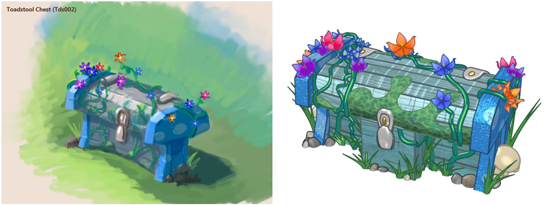
*Please Note: Since the mushroom would prevent items from being placed on top of the side table, we will be releasing it separately as a lamp.
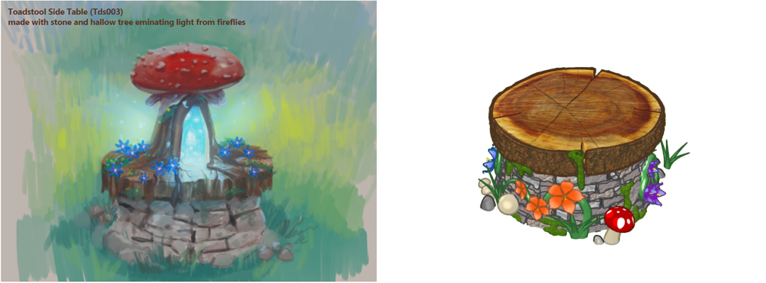
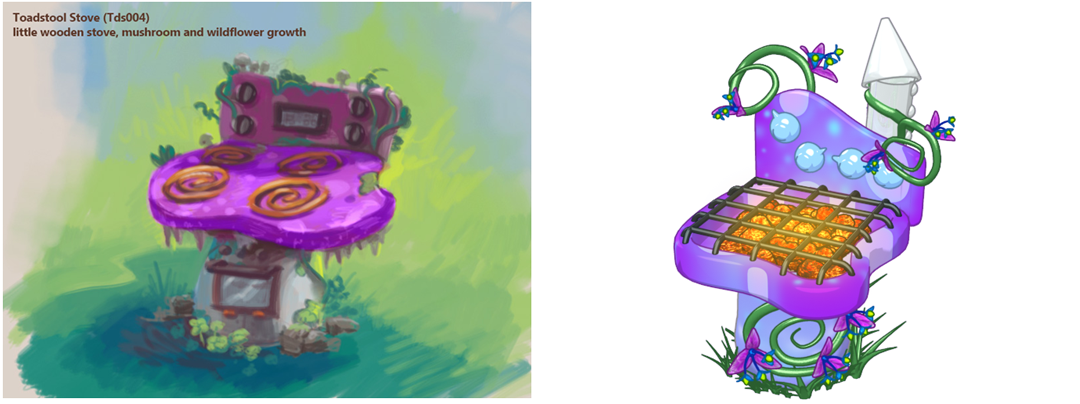
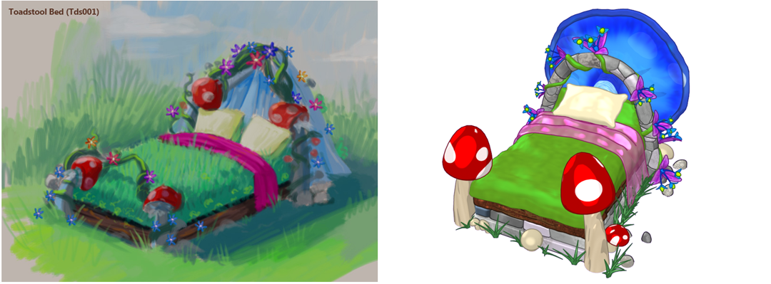
What do you think we should name these items? Let us know in the comments below!






AMAZING! I’m super excited! :D
i think the trunk should be named toadstool treasure trunk!!the bed should be called mossy bed !!the lamp is not a big problem but the stove is sooo bland
These are so pretty!!! Are these items going to indoor or outdoor only? I’d love to be able to place them in indoor, outdoor, and treetop rooms so I have more options for designing my house!
aw very pretty! i like the virtual stove and bed even better :) the drawings are also very very good
I think the toadstool chest should be called the toadariffic chest.
Here are my name ideas! (I posted the same ideas other places also) Names for the bed: Serene Settings Bed, Peaceful Place Bed, Enchanted Forest Bed, Bouncing Toadstool Bed or Whimsical Wonders Bed. Ideas for the stove: Magical Mushroom Stove or Overgrown Toadstool Stove. Ideas for the Chest: Wonderful Wildflower Toy Chest, or Beautiful Blue Toy Chest. Ideas for the Side Table: Enchanted Tree Stump Side Table, Many Rings Side Table, Rocky Ridge Side Table, or Magical Moor Side Table. Thanks!
ooooooooohhhhh. cool!!!!!!!
Those names are AWESOME kbk100! My favorites are: Serene Settings Bed (I believe you said that yourself on another post), Wonderful Wildflower Toy Chest, and as for the side table, EVERYTHING IS AWESOME. I don’t know which is my favorite for that one! They are all so good. However, since the stove doesn’t have any mushrooms or toadstools on them, I think your names are clever for it, but maybe not quite matching the item. Otherwise, great names! (Look on previous posts for my names for each item). :)
I like everything but the bed I don’t like it the first one was way better
I am sorry but…… I really liked the table and bed the way they were :(
i especially agree about the bed. the concept drawing is gorgeous, but the new one . . . the colors clash and i miss the drapes. :(
Me too :(
I know right, kbk100! I so agree! I liked them all the way they were before, in the concept drawings. *sigh*
I like everything before the changes. Think about it you will get 2 for the prize of one a lamp on a side table. I’m sure they will design a trophy table anyhow. I especially liked the bed before it was more fantasy like with the screen material that came down like a princess. more fairytale like. Please dont change the bed its perfect the first time
For all the people worried about the side table they did say that they would release it as a lamp so there is no need to freak out. I agree with paintinanc, the concept bed was so much better than the real bed! I’m sad that the bed is now the finished item and that is doesn’t look really at all like the concept art. The head of the bed has been changed and looks pretty plain right now compared to what you showed it to be, The bed part itself looked to be kind of grassy which was cool but its still plain now, and the foot of the bed had a vine and flowers while the finished piece is really bland and kind of blah in my opinion. I wish the bed was as great as the concept art. The chest on the other hand is perfect. I love how it matches the concept art.