You voted that the Toadstool theme should be the next room theme to be released in Webkinz World. We’ve already revealed the early concept drawings in earlier articles here, here, and here.
Now, here is a look at the first set of finished items, compared next to their concepts!
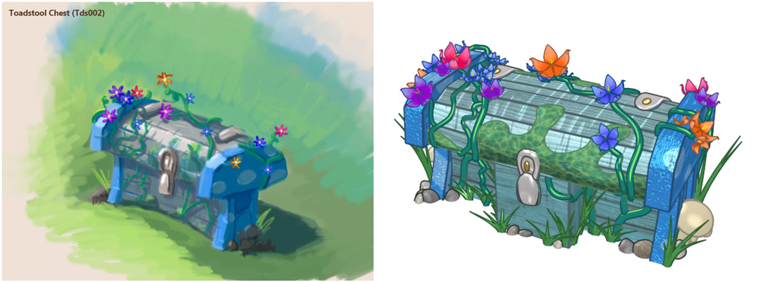
*Please Note: Since the mushroom would prevent items from being placed on top of the side table, we will be releasing it separately as a lamp.
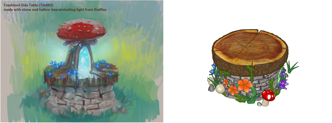
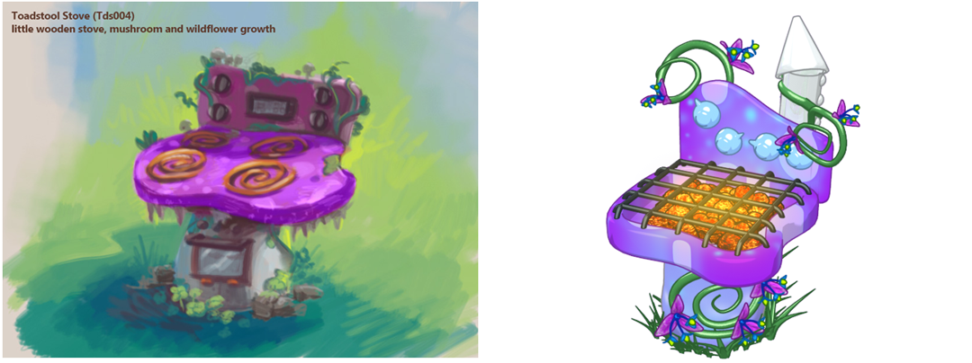
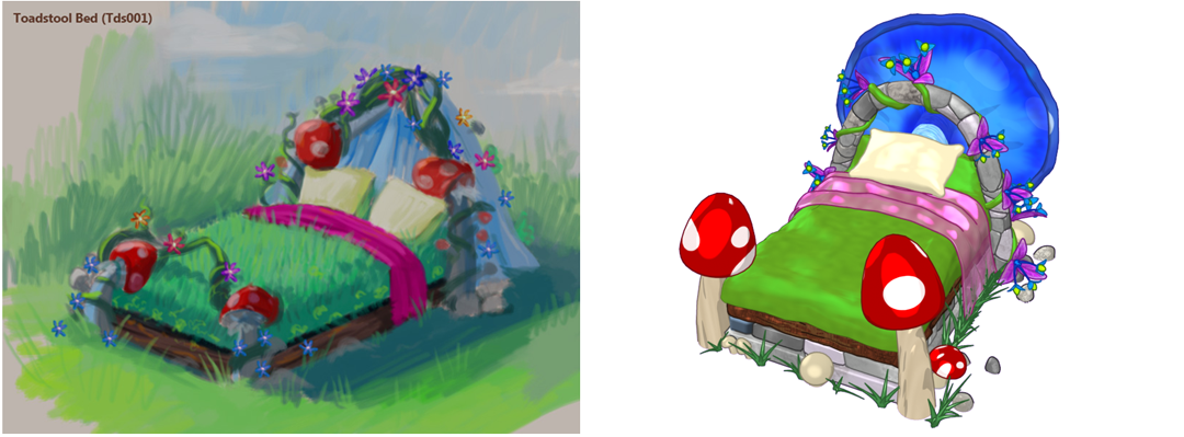
What do you think we should name these items? Let us know in the comments below!



I think everything should kinda glow like in the Mazin’ Hamsters Lagoon.
Toadally Toadstool Bed, Stump Toadstool Stool, Fairy Ring Secrets Chest, and Fired UP Toadstool BBQ
I would call the bed the Toadstool Fairy bed.
I much prefer the new bed over the concept drawing. It will be more gender neutral and not as girly as the original idea. Thanks!
“Sweet toadstool dream bed” for the bed
How about toadstool tree trunk for the side table?
I really hate the bed :-( it used to look so dainty. If that is the final product I will not buy it
OH MY GOSH!!!!! The stove is AWESOME!!!! I love the twilight blue/purple color!!!
I really agree with prprprprp, the slimy moss ruins it! I wish the citrus theme ad won, though….*sigh* I also wish that ganz made a wallpaper for this theme so it was optional if you wanted it indoors. I might get a few of the items. TIP: the celestial wallpaper would look good with this theme if it was indoors(another thing I don’t like, it is outdoor only :( )
I sort of like it, though :)
Chest: Hidden Moss Chest; Side Table: Toadstool Stump; Stove (Looks more like a grill to me): Grassy Griller; Bed: Garden Glen Bed (Slight modification from dinosaurtracker13′s name for it so half credit to them) I agree with a lot of people earlier in this post about the fact that taking away the grassy part of the bed giving it a 3D quality really takes away from it, however this isn’t a game known for that kind of thing, so it looks good. However, how come you got rid of the tree stump like base of the bed, giving it the image that it grew out of the ground? Not only that but you couldn’t include more flowers to make it cover up some of the fakeness of the back frame of the bed? Not only that but more toadstools would’ve been nice. I do think however that the blue toadstool on the back is a great idea, however if it was put on in a way that you could see it had grown off the bed or that it was connected to it like it’s roots stretching on the bed-frame? Again, stove looks more like a grill, unless that was your intention; couldn’t you at least have made 2 spiral coils on it, like small ones that just made it look more like a stove? The side table looks good, however why is the base of stone and then the wood stump seems to mushroom up on top? It kind of looks stupid, like what if it was just all a stump? Why the stone, seriously? But I hope when you come up with the lamp that it actually glows and looks fantastic cause otherwise people will be very upset as I bet you can see from these comments. The chest looks amazing, the only thing you could really do with it would be to “warp” it, as in make one side bigger than the other like it was handmade by nature. Though just as a personal thought I hope you’ll include a gnome or two because that would be so cute and awesome!
Cool that this came out but…*sob* :cry: I don’t like this theme anymore!!!! :( I liked the chest better the way it was in the drawing, you took off the toadstool and the fireflies from the side table and now it looks a little boring and less magical, I don’t like the stove in the drawing OR the final result, it looks wierd in both, and I am literally crying about the finished bed!!!! :( :( :( :( The bed looked much more beautiful, and magical, and wonderful, and beautiful before!!! I was so excited before!!! :( Why did you change it like this? I feel soooo bad right now…like a sinking feeling almost….and I am literally wracked by sobs and am actually crying about this virtual, not real, thing! I don’t feel so good now….:( :( :( :(