Our 3D artists have been hard at work, and today, I have your first look at part 1 of the new Trick or Treat Street room theme. This year’s Halloween theme will be available in the W Shop starting October 1st.
We have taken a lot of your suggestions into consideration when designing these final items, so I hope that you are happy with the way they turned out.
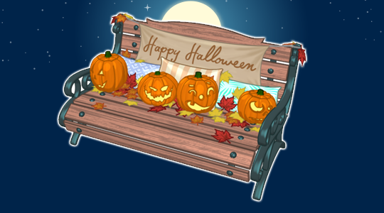
The bench looks very similar to the original concept drawing. The only real difference is that the pumpkins were made smaller and moved to the back of the bench so 2 pets could easily sit comfortably while taking a break from trick-or-treating:
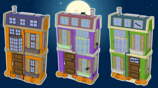
Here’s a look at those three Halloween homes. Several changes were made based on your feedback. The homes now have a slightly more modern look and the cobwebs were removed. There are also slight design differences to each home, like the position of the windows and doors. We also added different decorations to each house. How do you think they turned out?
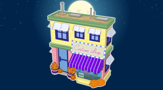
Finally, here’s a look at the costume shop. I think it matches the styles of the homes nicely. The best part about this building is that it will work as storage so you can keep your favorite Halloween costumes here!
Start saving your KinzCash now! This theme will only be available throughout October, so you’ll want to grab multiples of each item before they’re retired.
What do you think of this theme so far? Let us know by leaving a comment in the section below…





didn’t like it before but this is a great improvement. Thanks for taking suggestions. it’s going to be coo coo cool
The Halloween Bench is just perfect! The Halloween Houses are ALMOST perfect. They really need a few more Halloween decorations. Wreaths on the doors. Lights on the houses. A little more spooky. The Costume Shop is really nice. Love that we will be able to use it to store costumes. But…the color of the building is awful! Pink? Yellow? Doesn’t look like it belongs in a Halloween Village, but maybe when paired with all the other buildings and decorations, it will look better. Can’t wait to see all the other items! And…most of all….THANK YOU for letting this theme be bought for KINZCASH!!!!! :-)
add the cobwebs back
The townhomes look so much better! Will they still only fit around the edge of a yard or room? I would really like to be able to put them in the middle of a room to make more of a street effect.
I wish it was spookier.
The final versions of the bench and these four buildings look amazing! My thanks to the creativity and skill of the design staff! I’d also like to thank the Ganz staff in general – you read all our comments concerning the concept art and integrated our ideas and likes/dislikes into a final product that I hope everyone will enjoy. I am really looking forward to seeing the rest of the theme – I’ll be doing lots of shopping!
Cant wait for this theme to be released! :-D
great idea
Such a great idea to store costumes in the store! I actually love all of these, and I don’t generally like the Halloween themes. This one is a winner!
Great Job! I was afraid (when you said you had changed the first concept drawings based on feedback), they would be too cutesy, but I think with the added decorations to each building, they look fantastic. I am curious to see what other the additions to this theme will be, i.e. floor tiles, fencing, street lights, other decorations. I love the Christmas village items you did several years ago, it remains some of my favorite rooms.
oops, I just went back to the original concepts drawing and saw the fencing, light posts, floor tiles ideas…