The next time you log in to your Webkinz Next account, you’ll notice that one “Challenges” icon has replaced each individual challenge icon that were displayed along the left side of your screen:
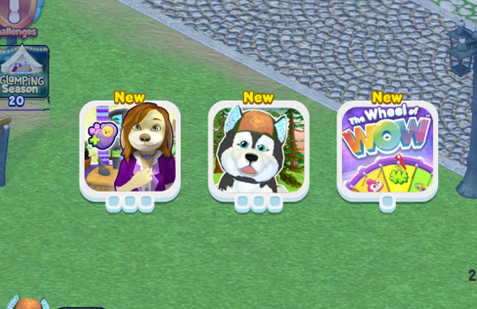
When you click on the new icon, you’ll see all your active challenges:
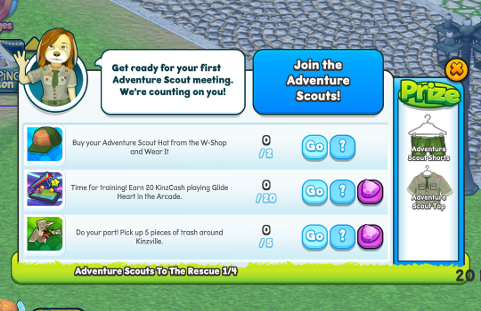
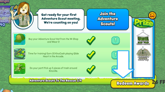
Click on a challenge icon to review your tasks and see what prizes you’ll win by completing them:
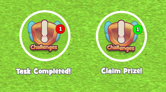
As you are working towards your challenges, you’ll notice red and green indicators being displayed on your Challenges icon. Red markers are displayed every time you complete a challenge task. The green markers are displayed when you have completed a challenge and there is a prize to be claimed:
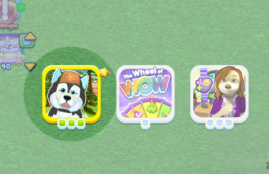
Claim your prize by clicking on the Challenges icon, then select the icon associated to the completed challenge. Completed challenges are easy to spot, because they will have a gold border:
Click the Redeem Awards button to claim your prize:
There are many prizes that you can earn by playing challenges, that you can’t find anywhere else. A lot of them can be sent back to a linked Webkinz Classic account too:
In order to link your accounts, you must have Classic and Next accounts with the same login info. Don’t have a Next account? Just log in with your Classic username and password to create one! And if you don’t have a Classic account, you can create one using your Next username and password!
CLICK HERE to learn more about linking accounts and sending items from Webkinz Next to Webkinz Classic!
Have you already completed your challenges? Let us know in the comment section below…
Download Webkinz Next now — available for iOS, Android and Windows 10:
Follow us on social media:





I LOVE the Disco lights in the Arcade! I was so surprised and excited the first time that I saw them!
I too was very excited about the disco lights!
Could you give players the option to switch back to the older look? The new icons are in the way, and the challenge icon was better in the old spot. I do like the new arcade lighting, as well as Marin’ Hamsters!
MaZin’ Hamsters…
I simply hate the relocation of the season icon, always in the way. Adding to the fact that the last update caused much more annoyance than the usual updates because of not letting the pet move around.
please update the game to be able to be scaled! Next and Classic, please! The default window size for classic is way too big and the fullscreen default for next is just now the way I like to play computer games. Please fix these!
I agree with everything Kaye10 said, and I also want to add that our pets look really creepy while playing Atomicolicious in the arcade since the update! All the pets look very disturbing with bulging eyes. It weirds me out and that was one of my favorite games :(
Please revert where the season icon appears, it now covers a much more prominent area of room designs, and blocks the entrance to the mine when at the curio shop.
kewel
ok–what happened here? you took two things that were perfect and made them both just plain wrong. COULD YOU PLEASE PUT THEM BACK THE RIGHT WAY. new icons are TOO LARGE. ALSO, they cannot be hidden as they could be before. also, the Challenge icon is just ugly & takes up too much space. the SEASON icon was moved from the best place it could have been to a terrible place as it is actually IN THE WAY, whereas it was never in my way before. sorry to have to share criticism, but i love this game & i may not be spending much time here anymore as this is not only annoying but also stressful. hope most people agree with me and post it. thanks & best to all, k.
I said the same thing about the Season icon…but of course got no response from anyone. Those things are now so distracting…they were much better before their changes. If it ain’t broke, don’t fix it!
I completely AGREE!!! The new icons are extremely obnoxious where they are & how freaking huge they are! There wasn’t any reason to change that to make it actually hinder our play. I’m not currently on any social media site but hope a lot will post all over to get it changed back.
I wish we could click and drag to put them where we prefer to have them. Also, I’d like to have the option to turn off the mirror ball lights in the arcade.
I completely agree! The new placement of the season icon is not as convenient as the original, and the challenges icon is way too large. They both cover up way too much on that side of the screen now. I don’t really like having to open the challenge icon to see which ones I’m working on as it requires more clicking to get to something that was once much simpler.
I would like to be able to take my pet outside my house. After the upgrade they are stuck in one spot and unable to move anywhere. Please, can you fix this issue?
Please contact webkinzsupport@ganz.com
Thanks ganz for fixing the issue.
Got the same issue, but restarting fixed it, though I did it many times.
The icons on the left are large and in the way to see the page very well. Would be nice if we had an arrow to close like on Classic or make those icons smaller and put them at the top.