The next time you log in to your Webkinz Next account, you’ll notice that one “Challenges” icon has replaced each individual challenge icon that were displayed along the left side of your screen:
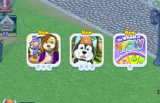
When you click on the new icon, you’ll see all your active challenges:
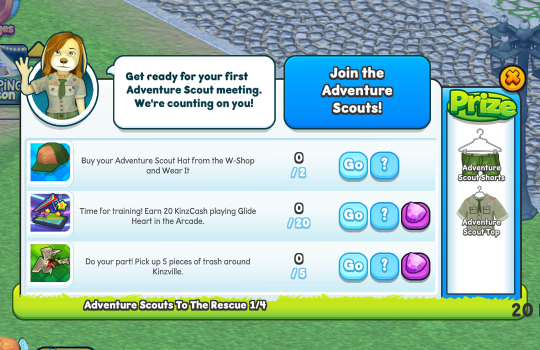
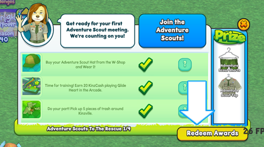
Click on a challenge icon to review your tasks and see what prizes you’ll win by completing them:
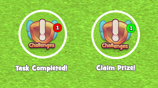
As you are working towards your challenges, you’ll notice red and green indicators being displayed on your Challenges icon. Red markers are displayed every time you complete a challenge task. The green markers are displayed when you have completed a challenge and there is a prize to be claimed:
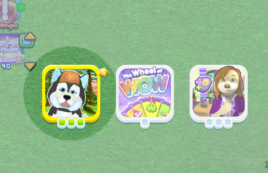
Claim your prize by clicking on the Challenges icon, then select the icon associated to the completed challenge. Completed challenges are easy to spot, because they will have a gold border:
Click the Redeem Awards button to claim your prize:
There are many prizes that you can earn by playing challenges, that you can’t find anywhere else. A lot of them can be sent back to a linked Webkinz Classic account too:
In order to link your accounts, you must have Classic and Next accounts with the same login info. Don’t have a Next account? Just log in with your Classic username and password to create one! And if you don’t have a Classic account, you can create one using your Next username and password!
CLICK HERE to learn more about linking accounts and sending items from Webkinz Next to Webkinz Classic!
Have you already completed your challenges? Let us know in the comment section below…
Download Webkinz Next now — available for iOS, Android and Windows 10:
Follow us on social media:







Is there something that will indicate we have a new challenge to do or will we have to click on the challenge icon every time we log on. I’m afraid I’ll miss something great if there is not something that tells me a new challenge is available.
I didn’t have a problem with the season icon on the bottom and the challenge icons at the top. Now that all the icons are at the top, they seem to be bigger and sometimes get in the way when I am decorating a room. I’m sure I just need to get used to it, but it would help if they were a bit smaller or if we could slide them off screen when we don’t need them.
Wait, are we getting new challenges?????