By Wiggles Pig
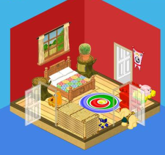
Sometimes designing a space you dig without digging too deeply into your pockets means making some trade offs. I was able to splurge on a few pieces for this boy’s bedroom while keeping within my budget of 2,500 KC by making smart choices elsewhere.
For example, I really wanted him to enjoy a beautiful meadow view, but the window I had in mind cost 485 KC. That’s a lot, but I knew I could compromise and still get a great look if I went with a 60 KC coat of red paint on the walls and On Deck Pirate flooring for just 150 KC.
With their cheerful primary colors, the Prairie Wood Bed and Circle Sensation Carpet gave me the playful look I was going for, but together they came to $850! Yikes! It’s a good thing I spotted these Tree Stump Side Tables for just $75 each. Tree stumps? In a boy’s room? What could be more perfect?
When I spotted the Joyful Jigsaw Coffee table with its bright primary shades, the final pieces of the puzzle started coming together. It fit perfectly with the Chunky Red Chair. And I could afford them both with one last trade off – an affordable Rattan Toy Box that works nicely in almost any setting.

So you see, my friends, when you’re designing a room on a budget, you don’t have to limit yourselves. You CAN include a few higher end pieces as long as you’re willing to trade off for some cheaper items too.


Poor Wiggles he just cannot decorate. I haven’t liked any of his rooms. You just have to make play games and make money, go on Quizzy’s and do the daily activities. Then buy the items you like. If you don’t have enough buy less, and your room will still look nice. I like to stay within the themes anyway with maybe a couple of extra’s here and there. Wiggles needs to go to school for design. …………………………………:)
Okay, so it’s a little cramped and the rug definitely doesn’t go with the other stuff. Most of the pieces don’t match, and it seems kind of cluttered. Good effort though!
its to countryish or obsolete i prefer well a lot O more modern
Usually i like these; but lately they are so too way too ugly+cramped!!!!!!
just a little crowded and the rug…well it really does not go to the theme to me but on the second hand its pretty cool!!!
I love that.
I do that a lot with my 14 girls,and it really works like a dream.
You can really save money as well!!!
Thanks a lot Webkinz World!!!!
You mean a lot in my life!!!!!
( Just to let you know! )
It’s too small to me. I usually would buy one large room for two boys so that it would seem bigger and the doors wouldn’t block out as much.
LUV IT! My describing words for it: Awesome, cute, beautiful, cool and sweet!
i dont like it
ugly……sorry.