By Wiggles Pig
Sometimes designing a space you dig without digging too deeply into your pockets means making some trade offs. I was able to splurge on a few pieces for this boy’s bedroom while keeping within my budget of 2,500 KC by making smart choices elsewhere.
For example, I really wanted him to enjoy a beautiful meadow view, but the window I had in mind cost 485 KC. That’s a lot, but I knew I could compromise and still get a great look if I went with a 60 KC coat of red paint on the walls and On Deck Pirate flooring for just 150 KC.
With their cheerful primary colors, the Prairie Wood Bed and Circle Sensation Carpet gave me the playful look I was going for, but together they came to $850! Yikes! It’s a good thing I spotted these Tree Stump Side Tables for just $75 each. Tree stumps? In a boy’s room? What could be more perfect?
When I spotted the Joyful Jigsaw Coffee table with its bright primary shades, the final pieces of the puzzle started coming together. It fit perfectly with the Chunky Red Chair. And I could afford them both with one last trade off – an affordable Rattan Toy Box that works nicely in almost any setting.
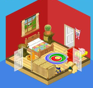
So you see, my friends, when you’re designing a room on a budget, you don’t have to limit yourselves. You CAN include a few higher end pieces as long as you’re willing to trade off for some cheaper items too.






I like it i think it could be a little better PLEASE DO A GIRL ROOM!!!!!!!!!!!!! :)
It’s NOT that cute. It does not look good at all.
Alright, that room looks way to cramped! Claustrophobic people would not like it in that room. I mean just looking at it makes me feel squished. It’s way to small, and that room has no flair what so ever and it doesn’t even match. Plain red walls, and no design on anything. How boring! And tree stumps with a praire theme, not good. Wiggles, you may be able to design on a budget, but you certainly have NO taste! Sorry!
If I were a boy I would run away.=(>
I don’t really HATE the room like everyone else says but i not like it anyways!
It’s not your best design!!!
Ok, we’re talking about a little boy’s room? HELLO? Cactus on the table! Pink bed! If I were a boy, I would not like that room at all! Sorry Wiggles. And there are toys around the room! Isn’t that what the toy box is for????? NOT impressed. Sorry
ew!
I thought that there would be before and after pictures- I thought this was the before picture…..oops. I don’t really like it.
that is what happened to me too! i was soo exited to see the new room and the i found out THIS IS THE NEW ROOM! and it does NOT look good
The room is alright but it looks extremely crowed to me and everything is a little mish mashed. The room also seems very dark and drab. I do like the end tables though and the flooring.
Agreed!