By Wiggles Pig
Readers, have you ever thought about making your own store? It can be a big endeavor, but if you start small and plan carefully, you’ll be able to create an inviting space to display your wares and still have enough left over to go shopping yourself. I recently worked with a client to design this light, cheerful store that is also light on the budget.
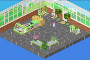
There are extra costs involved in planning a store so we gave ourselves a budget of 4000 KC – enough to cover the costs of stocking our shop without being excessive. My first step was to purchase some store displays from the W Shop. Although they used up the bulk of our KinzCash, they are a necessity for creating attractive displays. I had to compromise though – at 1100 KC, the Bottled Goods Display would just have to wait for now. I did however go for the Delicious Store Desserts Display (550 KC), the Snack Sampling Station (600 KC), the Store Checkout Counter (600 KC), the Top Shelf Store Ladder (350 KC) and the Waxed Cheese Display (400 KC).
Now I had to start conserving. Luckily, inspired by the fresh greens of my store displays, I found the Conservatory wallpaper which complemented it perfectly – and it was only 100 KC! In keeping with the outdoorsy feel of the greenery, the natural stone Wizard flooring was a lovely touch and the price tag was lovely too – only 125 KC.
One final splurge was a couple of Fresh Glass tables at 375 KC. They were costly, but I needed a bit more display space and they coordinated perfectly with the Store accessories and the leafy greens in the wallpaper.
With a few plants, a Rattan Toy Box for storage and a half Tatami mat, we were ready for business. And with our shrewd budgeting skills, I think my client is off to a prosperous start!






I love it! i have been trying to save up for the store theme you gave me some great ideas!
why does wiggles always use that bamboo toy chest lol
I might try this if I have enough money.
Lose the bamboo
Truefully, I’m not impressed. I don’t like this room.
Kind of bare. I think the stepladder was unnecessary, they could just but something else with the cash.
They should of used the medium sized room because this is to spacey and looks like it’s missing a ton of furniture. I just think that they need to fill upop the blanks but I do totally love their design!
you know, its called a store for a reason, there is supposed to be more than food in a store, even a Grocery shop has more than just food, the bamboo should not be in the picture, but the whole thing is ok
Ya, the bamboo looks really bad. :( but on the other hand the rest looks nice :)
I LOVE IT!!!!!!!!!!!! i would make it but i just bought a large room 4 the bloomin’ theme and i’m still not done decorating so it will cost a lot so i can’t :( i only have 9328 KC left!! :(