Our next task in the Henrietta Hippo Theater was to redecorate some of the dressing rooms. There’s some serious rockin’ going on out on stage right now so we were asked to design one dressing room with a rock ‘n’ roll theme.
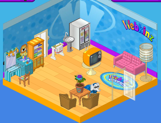
Here’s the dressing room as we found it. Cute, but a bit bland, you know? I really like the Superstar Styling Station in the corner, but when we replace that Webkinz Superfan Wallpaper I’m not sure it will fit with our new look. We’ll have to see. The wood flooring is nice but a little too vanilla for our rock star look and those wicker chairs and country table will have to go.

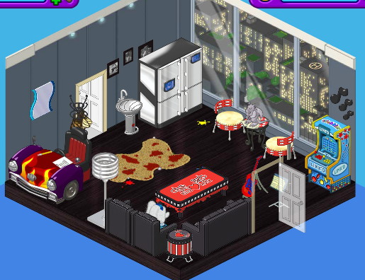
Here’s the new space. As soon as I checked out the new Mega Modern theme I knew it would be perfect for the look we were going for. We paired the Mega Modern Wallpaper with the Creative Studio flooring. A High End Fridge is a stylish place to store cold drinks and snacks, and we replaced the table and chair with a couple of Tamborine Chairs and the Radiant Red Mosaic table topped with a Gargoyle Paper Weight.
Boomin’ Black Couch and Lounge Chairs, a Studded Coffee Table, and Snare Sidetable were the ideal choice for the seating area in this room, and we decided to replace the dressing station with a Hot Rod Desk and mirror.
Finally we threw in a gaming station in the corner to keep those rockers busy. This is one cool room, don’t you think?


A very big improvement indeed. But the rug looks out of place, and why is there a sink there?!
Its ok I guess.
I dont really like it, it seems to junky-messyish. No offense to those who like it :)
Hailey, Elwin, aren’t dressing rooms usually in the basement or backstage or crammed into little used spaces without windows? The fridge is good, but it’s to big, a small white one with a white sink and white mirror over it would look better. A dressing table is needed for applying makeup and doing hair. The sofas are good for going over scripts and taking a break. Put some screens where the desk is and add a full length mirror and the room will be o.k . The room should be appealing to all preformers not just rockers. jennifer p.s. get rid of the throw rug, arcade game and pictures.
I liked the “before” sooooooooooooooo much better!
Keyword is dressing. Why is there a window? Nobody dresses infront of a window. This is not the first time they have missed the mark on the purpose of the room. DEFINETLY NOT. Consider what it is for, Hailey and Elwin! They have been missing the mark lately. This is the worst one yet.
For the most part, I like most of their designs. This one, though, the rug and the car thing need to go. You can’t do your hair and makeup in the front seat of a car facing sideways looking at a mirror you’d have to stand up to see. The window makes it look more like a flat than a dressing room, the gargoyle and sink are just ugly (the gargoyle is way too big for that table!), and the arcade game just doesn’t fit it.
I agree that Haley nds Erwin seem to be losing their touch – the last few rooms have looked like they were put together by a committee!
and whats with the designer purse rack? i dont think rockstars are super girly. i mean, who needs those? at least make the SPREE drumset in there. they need something to practice with. `”TDT”`
i agree, grimmjow18. Hailey all the way! :D