Hey, readers! It’s Hailey. My brother, Elwin and I have been tasked with another cool project, redecorating the Arcade Cafeteria. The Cafeteria is a great place to hang out when you’re visiting the arcade with friends, but it’s kind of a mish mash of furniture. They asked us to come in and try to give it a more fun and unified look. Elwin and I each did a design so let us know which one you prefer.
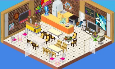
This is the original design. It’s okay, but I don’t really know whether it say ‘arcade’, you know? Also, there seem to be a lot of different styles of chairs and I’m not sure about those orange counters. They’re a bit glaring in this space. We want to create an area that is fun and welcoming where players can mingle while they enjoy their snacks.
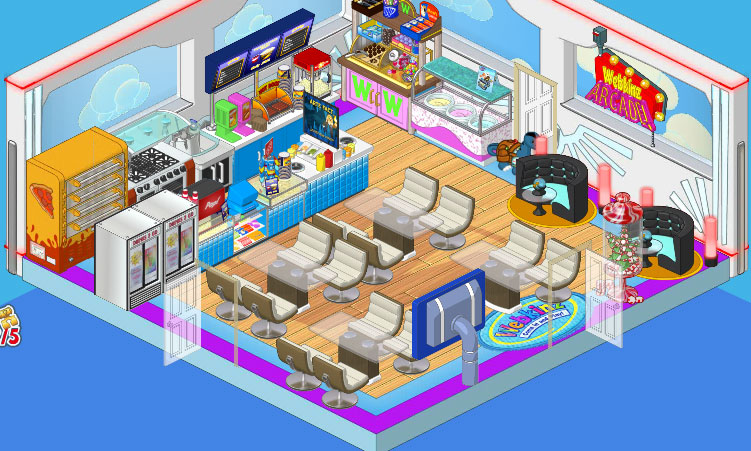
So this is Elwin’s design and I have to admit, it’s pretty awesome. He went with the Superhero wallpaper and the Superfan flooring. He added Concession Stand counters as well as a Professional Pizza Dispenser and Ice Cream Parlor Counter. Then he paired the Glass Topped Dining Tables with the Cream Crescent Dining Chairs, and put in a couple of After Party Booths in one corner for some extra seating with extra style.
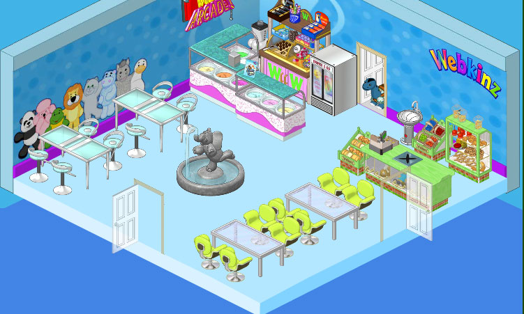
This is my design. I went with a cleaner, more spacious feel, you know? I wanted to have a focal point in my space so I chose the Elephant Fountain (I just love that fountain!) On the walls I used the Superfan Wallpaper and paired it with simple blue flooring. I included a couple of the Ice Cream Parlor counters and went with the Store Checkout Counter and displays. For seating I used High End Tables and Stools against one wall, and in another area I paired Brushed Metal Dining Tables with Lime Corinthian Chairs. I think it’s clean and simple and makes a great break from the excitement of the games in the Arcade, you know?




Wow… I really like both rooms. Hailey, your room is beautiful and spacious. The colors are calming and cool, and the fountain adds a peaceful element to it. It looks like a great place to settle down and have a snack. And Elwin, yours has plenty of seating for plenty of hungry pets. It’s modern and comfortable, and there’s a ton of different foods that pets can choose from. Both designs are lovely, but Elwin’s design is calling out as the winner. His design is exciting and fun, with a completely accessible kitchen. A pet can order food there that makes them get into the arcade spirit. Pizza, popcorn, hot dogs, slushies, ice cream cones, soft drinks, and sweet treats! Plus, his has more room for the hundreds of Webkinz who crowd in during lunch time. If I could suggest anything, I would suggest adding a healthier counter for food, like a sushi bar or some bread and cheese displays. Something for pets who don’t want junk food. As for you, Hailey, I’d like to suggest using your design in a museum or hotel. It’s beautiful, just not arcade style. Elwin has definitely won this one. :)