Hey, readers! It’s Hailey. My brother, Elwin and I have been tasked with another cool project, redecorating the Arcade Cafeteria. The Cafeteria is a great place to hang out when you’re visiting the arcade with friends, but it’s kind of a mish mash of furniture. They asked us to come in and try to give it a more fun and unified look. Elwin and I each did a design so let us know which one you prefer.
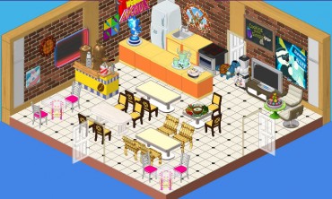
This is the original design. It’s okay, but I don’t really know whether it say ‘arcade’, you know? Also, there seem to be a lot of different styles of chairs and I’m not sure about those orange counters. They’re a bit glaring in this space. We want to create an area that is fun and welcoming where players can mingle while they enjoy their snacks.
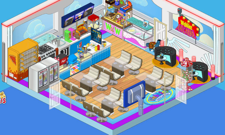
So this is Elwin’s design and I have to admit, it’s pretty awesome. He went with the Superhero wallpaper and the Superfan flooring. He added Concession Stand counters as well as a Professional Pizza Dispenser and Ice Cream Parlor Counter. Then he paired the Glass Topped Dining Tables with the Cream Crescent Dining Chairs, and put in a couple of After Party Booths in one corner for some extra seating with extra style.
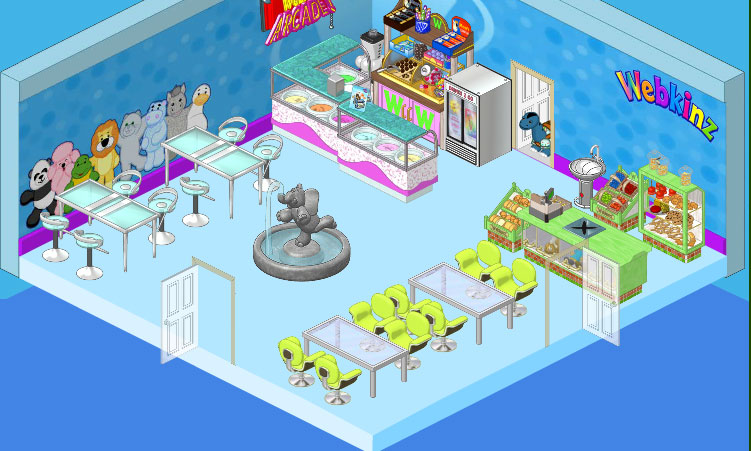
This is my design. I went with a cleaner, more spacious feel, you know? I wanted to have a focal point in my space so I chose the Elephant Fountain (I just love that fountain!) On the walls I used the Superfan Wallpaper and paired it with simple blue flooring. I included a couple of the Ice Cream Parlor counters and went with the Store Checkout Counter and displays. For seating I used High End Tables and Stools against one wall, and in another area I paired Brushed Metal Dining Tables with Lime Corinthian Chairs. I think it’s clean and simple and makes a great break from the excitement of the games in the Arcade, you know?





The update on the vote is…….(drumroll please)………….72 elwin and 38 hailey!
i like Elwin’s!
I don’t really like either of them. I’m not trying to be negative, I think they are cool, but neither design is me. Hailey’s Room- really spacious, not really “fun” Elwin’s Room- too much stuff! really more jumpy. I would pick Hailey’s room. It’s just, more relaxing. More me. I do think they should have those blue and black sofas, whatever room it is. I completely fell in love with those, and think they’re great for having fun with friends. All the best!!
Elwins just looks like so much fun. a great place to hang out with friends with lots of snack choices
Hailey. ~()PrincessLuna4Ever()~
WOW…….ummmm…..I will count the votes and get back to u on the overall score! And I can’t tell who’s design is better….elwins is to cramped and haileys is to spacious!
Elwin get my vote this time.
I like Elwin’s.
Wow these are very nice break rooms..I think I am more inclined to go with a more spacious look . If you have a very large crowd then you need more room to put them. While Elwin is more upscale looking I like the feel of the space when you get large numbers of webkinz in one space. The fountain lets your adrenaline settle a bit and yet you still offer ice cream.. I mean who can resist ice cream?
Ok, I’m starting to think I like all of Halieys designs better overall. But not sure. Definetly Haliey’s. I mean, no offense to Elwin, but there is WAY to much furniture in there!