Hey, readers! It’s Hailey. My brother, Elwin and I have been tasked with another cool project, redecorating the Arcade Cafeteria. The Cafeteria is a great place to hang out when you’re visiting the arcade with friends, but it’s kind of a mish mash of furniture. They asked us to come in and try to give it a more fun and unified look. Elwin and I each did a design so let us know which one you prefer.
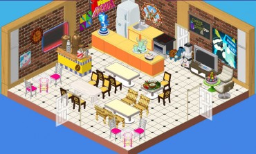
This is the original design. It’s okay, but I don’t really know whether it say ‘arcade’, you know? Also, there seem to be a lot of different styles of chairs and I’m not sure about those orange counters. They’re a bit glaring in this space. We want to create an area that is fun and welcoming where players can mingle while they enjoy their snacks.
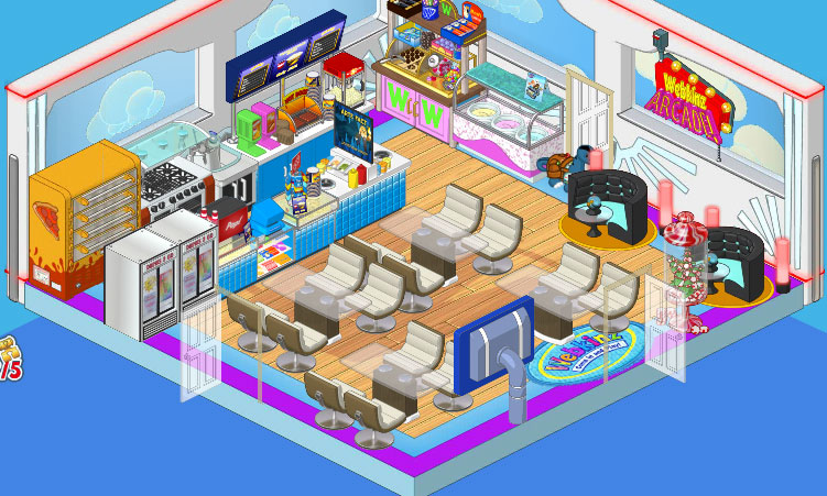
So this is Elwin’s design and I have to admit, it’s pretty awesome. He went with the Superhero wallpaper and the Superfan flooring. He added Concession Stand counters as well as a Professional Pizza Dispenser and Ice Cream Parlor Counter. Then he paired the Glass Topped Dining Tables with the Cream Crescent Dining Chairs, and put in a couple of After Party Booths in one corner for some extra seating with extra style.
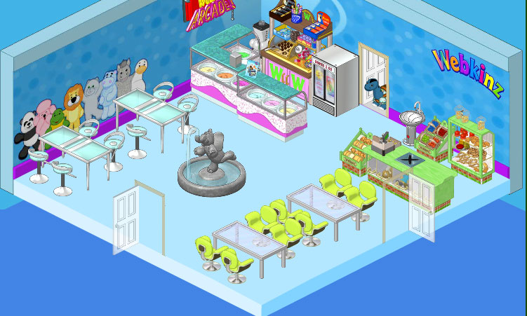
This is my design. I went with a cleaner, more spacious feel, you know? I wanted to have a focal point in my space so I chose the Elephant Fountain (I just love that fountain!) On the walls I used the Superfan Wallpaper and paired it with simple blue flooring. I included a couple of the Ice Cream Parlor counters and went with the Store Checkout Counter and displays. For seating I used High End Tables and Stools against one wall, and in another area I paired Brushed Metal Dining Tables with Lime Corinthian Chairs. I think it’s clean and simple and makes a great break from the excitement of the games in the Arcade, you know?





I like Elwin’s room more… Like there is a clutter of fun! Hailey is pretty much too clean looking… Elwin’s is much more fun!
Hey guys you did very good with that room great job
I don’t which is better. So I think that both win my pick. But hey I’m just a beginner in this whole thing. So I don’t really know which would be better. So once again both win my pick. *Lizzard777*
i personallythink that hailey’s design looks more like an ice cream shoppe. so im going to have to say that i like elwin’s design better
I like Haileys spaciousness and Elwins atmosphere and tons of food options.. they should combine ;o)
I like Elwin’s design just a tad bit better, but they both are very nice. Well done!
Bean? I think Webkinz rocks, and so does designing rooms! Elwin totally won this round as I said before, but even though I only like 2 of Hailey’s, I am rooting for her. Elwin does a really good job using bright, vivid colors, but sometimes you need a break from that fantasy, so I would go with Hailey’s then. Hailey won the library round by a landslide, though! It was so relaxed, serene, amd peaceful, while Elwin’s was like the Middle Ages. He TRIED to make it look like stuff was popping out of the book, but that was FANTASY! I mean, I like books about friendship and stuff and cupcakes, but would I turn a library into a cupcake kitchen? NO! Hailey’s room was too empty in the last round, the Contestr place, while Elwin’s was perfect. Hailey won the Principal’s Office re-design, Elwin’s was too GREEN! Well, Elwin’s in the lead, so Hailey better pick up her pace!*~Ruchirock~*
OMG! Hailey’s is SO much better. Hers IS roomy, but it has a spectacular arcade feel to it. After playing in the arcade, you’ll get pretty hot, and everyone knows, that cramped spaces lead to hot Hot HOT!!! Where as in Hailey’s, it feels more relaxed and you can grab yourself some ice cream, then go sit by the fountain and cool off! That’s what I would want! *Moon*dust*
ELWIN’S IS AWSOME!!!!!!!!!!!! :) :) :) :)
i really can’t decide! i like them both a lot! (if u are wondering, i didn’t sign because 4 some reason it won’t let me right now!)