Webkinz fans! Hailey here with a question for you: what would YOU do if you were given access to all of THE most beautiful things in Webkinz World and could use those beautiful things to make THE best kitchen ever?
Answer: you’d jump up and down and yell and cheer and high-five your twin brother and run around your house a little bit and then collapse in a chair and start sketching your ideas.
OK, so that’s what I did.
But still.
Anyway, what happened is this: yesterday Fluffington St. Bernard(THE Fluffington St. Bernard) called me and asked if Elwin and I would be willing to submit some ideas for his new kitchen makeover. He’s got Wiggles sending him a couple of designs, too.
So…that’s where YOU come into things: we need your help to figure out which design is best. Here are our favorite three – one from Elwin, one from Wiggles and one from me. Tell us in the comments which room you like best – and Fluffington will announce his preference next week!
Hailey’s Design (Option A):
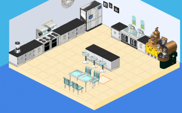
Simple, sweet – and caffeinated! Check out the coffee and espresso station!
Elwin’s Design (Option B):
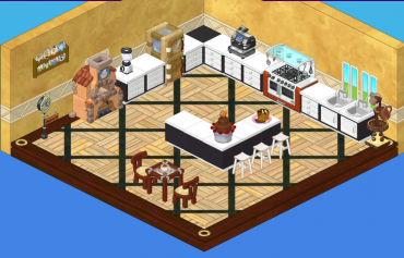
This kitchen makes good use of chocolate – and LOTS of it!
Wiggles’ Design (Option C):
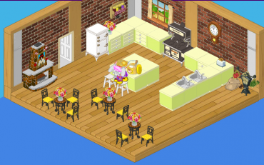
I had to check out the competition!
So…please help Fluffington choose his kitchen by telling him which design you like best!







I like Option B the best!
I like Kitchen Option A.
I really like option a. It’s so modern.
yes, me too. choice 2 is not very appeasing to me. choice three and choice 1 just come and say to you, POP! from all the color! and, one can only say, “elwin, chocolate is not a theme!”
I like (C) Wiggles the best.
C. I like it.
I LOVE opt. B.. :)
Number 2
I think I like Elwin’s design (opstion B)
(Option C): BY FAR
Option A for a home kitchen.
Option C for a coffee shop or restaurant.
I agree with you. To me option B doesn’t seem like something the richest kinz in Kinzville would want. Just my opinion. By the way, did anyone else notice that Hailey and Elwin both used their designs to cover up the door, but wiggles didn’t?
I like number 1 the best.
~KatieFly
I like Hailey’s (Option A) design best, although it’s a little empty.
Totally Hailey’s!!!!! It is sooooooooooo organized!
SO LOVE HAILEYS!!!!!!!!!!!!!!!
i like Hailey’s.
Elwins Design is so much more better. It looks like someone’ kitchen who is rich!
Hello?!
Awesome kitchens to all, but Elwin’s I love!
:D :) :) :mr. green: :mr green: I LOVE (not really) Hailey’s choice A I’m homeschooled too :)
hey i’m homeschooled!are you?
Choice A
I think the first one looks like the most modern :) The second one looks like most home sweet home :D And the therd one looked like just so sweet :’) But If it wa sfor me have to chose 2! But the therd one I think looks like fluffington have jused new kitchen furniture in a old castell room, COOL! I think…? So for him I can just say, Get 3 kitchens! ;D
The first one looks a lot like mine….scary. But I like the A the best.
CHOCOLATE!!!!!!! CHOICE B!!! lol :)
I agree… I love Elwin’s! (choice 2) Go Chocolate!!!! :)
I love all of them, but i love b the best not only it’s really patterned looked, but it’s amazingly choclaty
I like specifics things about them all. I want to condense them into 1 amazing kitchen!!!!! lol
I really like how the yellow chairs pop out at you
CHOICE 2!!!!! DEFINITELY!!! I LOVE CHOCOLATE AND ALL THE DESIGN AND IT LOOKS SO MODERN!!!!!
Umm…I like both Hailey and Elwin’s designs, but I like Elwin’s just a tad bit better, despite how much I despise chocolate. :)
I would totally choose Hailey’s kitchen-choice A. I don’t really like Elwin or Wiggles kitchens too much. But if I could put parts of all 3 together that would be neat! :)
me 2!! i like haily’s- choice A. it is simple and looks organized. hope they use it!
I Agree with Y’all Go number 2 and Go CHOCOLATE!!!
I would agree with Cinnybugg.It has to be #2.I guess option B seems more fancy and a bit classic at the same time.
Choice b i I picked that one because i love chocolate :) chocolate …. chocolate …. chocolate…. chocolate …… chocolate …. chocolate …. ….
chocolate ….. chocolate …….
I like choice B it is the best!!!!
i personally like elwins..choice B. the only thing i dont like about it is the flooring… they should have used a tile flooring or maybe even wooden instead of the crisscross design.
A. I love modern.
Wow! I totally agree! Elwin’s is just awesome, but I don’t like the flooring. Too confusing….
In my opinion, Hailey’s kitchen is too modern-ish and it’s too empty.
Wiggles’ is okay, but it looks more like a nice breakfast restaurant than a kitchen.
But if Elwin’s kitchen had Wiggles’ flooring….
A flawless masterpiece!
P.S. Add me! My user name is BabyMinkey.
P.P.S. I really <3 chocolate!
b
BTW………. it’s “third” not “therd.” and i like option A. B looks like it was destroyed by a tornado and C looks like anyone can walk in and sit down which is kind of nice but not when you come home and find a random hobo in there. FREAKY.
u r tot right, i know more about fashion! BTW i dont like ANY of the choices but if i had 2 choose i would pick A.
Love chocolate, but A is the least confusing. sweet, simple, and cool-looking!
A. Very Modern. Not really Fluffington’s style. B. Mixture between modern and home sweet home. C. We are in the modern days, this is just too old. Answer- I chose choice B because it is Fluffington’s style with a warm, modern, chocolate twist. I love it.
room 2
yah i’m with you :mrgreen:
choice A i love it!!!!!
ANYBODY WOULD BE LUCKY TO HAVE CHEF GAZPACHO’S OVEN…LOVE OPTION B IT IS MY FAVORITE
yeah i agree A
I definitely like Choice A, it looks nice and clean! :-)
a or c B look just to old mix and match for me
I agree with webkinz girl choice B’s floor doesn’t work
Yes, choice A is nice, but it has to many gaps. Choice B is was to clutter and it really does not match. YOu should choose choice C fluffington! It is modern and very pretty, it will brighten any home. not to mention it is a bit regal looking yet it is so simple an beatiful. Hope this helps!
i like Choice B. but maybe a different flooring. add me as a friend at pinetoparizona349 if you agree! :mrgreen: (you can add me even if you don’t agree).
hailey’s….Where is that elephant!!!
Really choice A!!!!!!
All are really cool, but Hailey, I got to hand it to you, yours is best.
no way! wiggles won.
Yeah i totally agree.
I LOVE choice A it is the best out of the 3 in my opinion
i like hailey’s (A) and also wiggles’ (C) designs :)
Choice 1,definetly.
A SO A
CHOICE A
I LOVE A
Definitely option B
yeah! sorta like c, but b is to much too look at
totally A!!!
I would say that I would choose A or C I don’t like B because it’s too brown. C looks modern and cute.And A is so cool and modern, like a cafe almost.
i think a too.
i would say choice B. but the floor hurts my eyes
I totally agree choice A (Hailey’s). B’s flooring makes the room look small and there’s not alot of seating. With C the St. Bernard PSI idem is kind of the only possitive. The seating is too small, l really mean the seats are minute. Plus with A my choice the espresso station is ideal for the morning.Also the hot chocolate machine is perfect for a chiily night. Choice A definity is my choice. :~)
Choice A for sure.
I agree chose A is beautiful and chic! LOVE IT!! Please choose chose A :)
Choice C.!Choice C.!