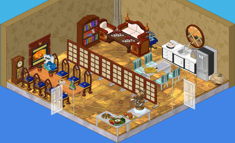
Hailey and I agreed that when we had a studio of our own, we’d have an awesome break room. We also needed a very spacious and official looking meeting area. In this case, it’s the same room! We just got creative in how we divided it up.

As you can see, the left part of our room is all about meetings. We’ve got a big, long boardroom-type table, some delicious snacks (and a fancy drink machine), and a fireplace (for ambiance!).
On the right side of our room, we’ve got a kitchen and seating area. And let me tell you, that couch is surprisingly comfy and nap-worthy.
Not that I’d know from experience.
Ahem.
Anyway, I’m really pleased about how the whole thing turned out. Having two doors makes it extra-convenient to go into part of the room while not disturbing anything that’s happening in the other area.
What do you think of our meeting room, friends?


You’re a remodeling wiz!!! I’d pay you to do my room any day. If you used estore?????? And walls and floors shouldn’t be in the same theme but still match! Make me a kitchen! *~Ruchirock~*
I actually liked the room a lot and i think u guys did a great job! keep it up!
It’s a great idea to divide the room like that, so it serves multiple purposes. I like it, especially the flooring, and the fancy snacks and drink machine. Good job!
I love it! it looks really good! keep it up you two! i can’t wait to see more! >> cat lover cathouse2
I like the room! It has everything you need for both functions, and the two doors is a great idea. I am amazed at how much space you have available to you … the reception area, individual studios, and a meeting/break room. Good rooms, good space. All the best! MDIChickadee
LUV IT!!!!!!!!!!!!!!! I’m sure the couch is VERY comfy Elwin. XD LOVE THE 2 DOORS!!!!!!!!! *Your friend Orange Starburst,*
Ya I can see me using both parts of the room. Like that you have two ways to enter without disturbing one another.
you got the good thouch of calm, casual, and brought in the good place for adult’s to relax from a hard day. i like all the wooden tones. the only objections i have to this room are the kitchen. the kitchen is a lovely place but when you look over to the living room and the rest of the place, it looks out of place. and i really dispise those dining chairs. light blue is not meant to be in that room. but other then that YOU GUYS DID AMAZING!
I really like all their rooms that they made for themselves. They are really cool. I can’t wait until they design Roberta’s new room in her brand new home! (Not like they found one yet or sold their old house!)
i dont really lik the room~-~one direction luver
I honestly don’t love it, but that’s just me, it’s a good remodeling job.
IT’S AWESOME!!!!!!!!!!!!!!!!!!!!!!!!!!!!!!!
I don’t really like it… if you’re going to make it brown, USE MAHOGANY.
Are you KIDDING? This is the best room yet!! Love it. (*(*dragonfish*)*)
I think they did a great job! Your friend sarahandlacey! :lol: :mrgreen: ;-) :-) :roll:
My name is Effie.
This is a nice room, but it’s just……. Bleh. It needs more COLOR! More SHAZAM! Ok even I am LOLing at myself for saying “SHAZAM!” Hehehe.. But seriously, I know Hailey and Elwin to add more COLOR to their designs! This is just boring! And bland! Yeah, THERE’S the word I was looking for. The kitchen area is sorta nice, but the rest of it? Yuck. (But I would eat the snacks…… XD ) So there’s my opinion. Byes! ○♥○MRT○♥○
Yea Its Kinda HUGE I Mean How Many People Would WORK There For So Many Chairs *~*Sonici*~*