Hailey and I agreed that when we had a studio of our own, we’d have an awesome break room. We also needed a very spacious and official looking meeting area. In this case, it’s the same room! We just got creative in how we divided it up.
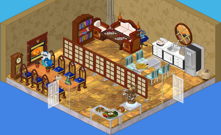
As you can see, the left part of our room is all about meetings. We’ve got a big, long boardroom-type table, some delicious snacks (and a fancy drink machine), and a fireplace (for ambiance!).
On the right side of our room, we’ve got a kitchen and seating area. And let me tell you, that couch is surprisingly comfy and nap-worthy.
Not that I’d know from experience.
Ahem.
Anyway, I’m really pleased about how the whole thing turned out. Having two doors makes it extra-convenient to go into part of the room while not disturbing anything that’s happening in the other area.
What do you think of our meeting room, friends?







I like the room, but I might change the walls and floor color, to make the room a brighter, yet serene and a little bit business-like.
Really good job you guys! Very creative! <3
It’s an OK room. It would be better to not have the table and chairs right up against the fireplace and clock. Scoot it all down at least one space. That comfy couch is totally blocked. I don’t like to move stuff around to seat my pets in a room. I also don’t think two snack areas are necessary. It would be nice to have a plant or flowers….brighten the place up.
I like the floors. The room itself is not the best.
I have the same Sandwich Maker :) Your mellow bud, fr3d420
What is that flooring, Estore maybe?
It mostly looks like a church but I like church rooms.
This room rocks! It’s amazing! You too are wonderfull disingers! (Sorry for bad spelling)!
That’s a very nice room guys! The only thing I’m not sure about is the wallpaper. It’s kind of ugly.
I think it is awesome! I should have you guys come over and help disign my pets’ rooms.