Hi! It’s me, Elwin. Hailey’s and my friend, PJ Collie, was so happy when we helped her out with redecorating her basement apartment that she asked if we would come into the KinzStyle Outlet and take a look at the Makeover Room.
It’s a pretty cool room but PJ said she was just getting pretty tired of the yellow and she wanted to change things up a bit. So we decided we would each have a go at it and PJ could decide which option she liked best.
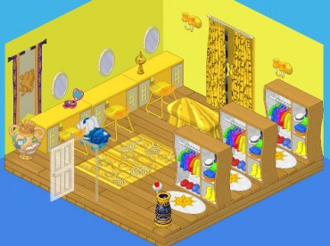
Here’s the original room. Not bad, huh? But I see what PJ means about the yellow. It is kind of overpowering. Let’s see if Hailey and I can do better.
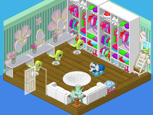
Hailey came up with this casual and relaxed soft green room. The Bloomin’ Room wallpaper, with its funky flowers gave us great starting point and the floor-to-ceiling Queen of Pop Closets offered a ton of storage. A couple of White Silk Sofas provide a perfect area for clients to relax while PJ puts together an outfit for them and the Lime Corinthian Dining Chairs and Frosted Top Dining Tables made ideal makeover stations with the Ballerina Wall Mirrors.
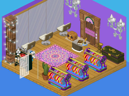
I decided to go a little more glam with my look. I painted the room a bold purple and threw in a funky Studio Loft Elevator, flanked by two Wondrous Wall Chandeliers. The Violet Persian Rug picked up the purples in the wall and elevator, while the Grand Empire Chest added a certain majesty to the space. I went for Dance Studio Long Mirrors and Cream Crescent Dining Chairs for my makeover stations. For storing the clothing items I chose three Stylish Clothes Racks, and I gave PJ a Glass Topped Dining Table for her work area. I also included a coffee station for clients to enjoy a beverage.
So now PJ has really got her work cut out for her, trying to decide which option to go for.






I would still say Haily’s. Oh and the ladder is so they can reach the clothes.
Totaly Hailey’s! She has more clothes, and it isn’t over done. @ cstanz : the resone she has a laddler is to get clothing down from the hier shelfs. It’s just there for storege. Not to clime out a window. (: <3 Ra@ningSt@r
Again, Haliey’s is best by far! :roll:
I think that Hailey’s is better. personally I don’t want ‘glam’ like Elwin said. I think that a makeup room is just for that . You would be distracted at all the glam, and wouldn’t pay attention to what YOU look like , just the ROOM! love ccaterpillar
I like Hailey’s room better, but I don’t know why she put the ‘ladder’ in the corner leading to an open window, that just doesn’t make sense. Elwin’s room is nice, but if I were going in for a makeover I’d want calm and relaxing, which is what Hailey achieved with her design.
Hailey agian. hailey for me has had 4 of my votes and elwin has had 2. i am sorry but elwin i did not like your room one bit. is there something wrong because i used to think you were a better desighner than hailey but now …i am not so sure.?
This is hard, but I think that I like Elwin’s better.
I agree Grace. I actually like Elwin’s furniture, and I just like the room. I really like Hailey’s rom too, but I don’t like wallpaper. I would say 9 out of ten for Elwinn and 8.5 out of ten for Hailey. I have been liking Hailey’s rooms better overall.
WOW! I totally want the big clothing box on the 2nd room! Love it! ~Majestic~
I like Hailey’s room better. Then again Elwin’s room is good too, i can’t decide. ~Midna
Again, HAILEY! Give up, Elwin! Hailey’s better!
I like both! I don’t like elwins rug in the middle.
I like all three of them! My favorite is Elwin’s design, he did a very good job. I also love Hailey’s design, I love the way she went with such light colors! ~SilverFluffy
Hailey’s is really good but I like them both. *Luv from LillyLuvie*
I like both but, I have to go with Hailey`s. happpiness vaquitanine
@SilverFluffy Agreed with ya! ;) ~Chicago Made☠
I like Hailey’s better. ~Hello Kitty ROX! ^.^
OMG I <3 hello kitty!!!! but I like Elwin's more. Mostly. I don't like the rug but I LOVE the dance studio mirrors! they make the room feel alot bigger! ****never stop dreaming!****
i to like Elwin’s room a little better. but i do like one of Hailey’s room. it’s very colorful! :D it is funny that there is a ladder to reach the clothing! :P
Hum, well it’s hard for me to pick! Elwin’s room gives me a warm and cozy feeling, but Hailey’s room gives me a clothes store feel! I just I’ll go with Hailey’s room! It so bright and colorful! Your friend sarahandlacey! :lol: :mrgreen: ;-) :-) :roll:
I am liking Elwin’s desines, but there so much FOOD. Almost EVERY single room he has made so far has food! So I’m going with Hailey this time. Elwin needs to try something else! It’s not a resturant!! ♠♠♠TheGameStar♠♠♠
I just noticed Hailey has some drinks too! ♠♠♠TheGameStar♠♠♠
I have to say, Elwin’s is much better! You rock Elwin keep up the good work!
Hailey’s!! Its bright and colorful too! It is the BEST room yet! Your true friend, **$**furryhairylion**$**
Wow. They both did a good job, but Elwin’s design is just way too random. Hailey actually has kind of a theme, but it seems that Elwin just grabbed a bunch of random things that look nice by themselves or with something else. All the items Elwin stuck in there just do not fit together. Hailey’s items really just fit. Like a jigsaw puzzle. Oh, and to cstanz, the ladder is movable. If you need to reach some clothing from all the way at the top, you can move the ladder there. Ok? Now, I will give my vote to Hailey! ♥~Silverfang~♥ P.S. I am still trying to think of a new name. LMK if you got any ideas!
I LIKE ELWIN’S ROOM THIS TIME….SO FAR IT IS A TIE…THEY ARE BOTH GREAT DESIGNERS AND HAVE THEIR OWN UNIQUE SENSE OF STYLE!!!!!!!!!!!
Defiantly Hailey. Hers has such a comfortable setup, and like @Silverfang said, Elwin’s furniture doesn’t fit. Hailey 5 Elwin 3 I’ve been keeping score by majority vote.
Hi Benny Beagle! You are right: it is Hailey again! I love the light and calming colors and the space: when getting a makeover, there needs to space for the yes’s, the possibilities, and the no’s. I am impressed by Elwin’s – I love the colors, but would like it better if he had not used the floor-to-ceiling mirrors and had provided a table for each makeover chair – people are different and I do not know how PJ would more than one person from a central work table (of course, PJ could address this issue better than me …) I would have liked to have seen some flowers in Elwin’s room, too. Both are nice, but, in this instance, Hailey’s is better. All the best! MDIChickadee
Again, I have to go with Hailey. Sorry Elwin, but Hailey’s designs are just better than yours.
Why don’t you combine both ideas Hailey and Elwin? Hailey’s room and Elwin’s… Elevator??? -Tiffers-
I like Hailey’s a lot better. Elwin’s is so dark and unfriendly. Hailey’s is calming and flowerfull! Hayley’s clothing storage is also one million times better.
ELWINS IS MUCH BETTER! SO CUTE! DONT FORGET TO SMILE!
i think the original one looks nice 2! it’s very sophisticated looking, and bright n sunny n all. ~tigerstripe
Well, Hailey’s looks fresh and posh, while Elwin’s looks more professional. The only thing I would change about Elwin’s is to get rid of the rug. I guess I have to go with pros against cons (Out of ten) Hailey:10 pros, 0 cons. Elwin:9 pros, 1 con (the rug). Go Hailey :!: :!: :!: :D :D :D Have Serenity :!: -Serene :mrgeren:
They’re both good, but I like Hailey’s better. It’s light and cheerful, while Elwin’s looks more likea lobby with the lights and the elevator… wait, an elevator? In a make-up room? ;) ~*Dawn*~
Uhhhh, seriously Elwin improve your furniture placement. I choose Hailey again because Elwin’s is just sisnister. It has a fortune telling booth sort of air. And whats up with the elevator, I mean seriously an ELEVATOR in clothing design room. Plus it’s placed behind a desk! You wouldn’t want people coming in and out just behind you and maybe ocasionally running into you. Just saying my input. *~Artistic~*
I agree w/ you !!!!!!!!!! BUT I dont like the owl } :