Hi! It’s me, Elwin. Hailey’s and my friend, PJ Collie, was so happy when we helped her out with redecorating her basement apartment that she asked if we would come into the KinzStyle Outlet and take a look at the Makeover Room.
It’s a pretty cool room but PJ said she was just getting pretty tired of the yellow and she wanted to change things up a bit. So we decided we would each have a go at it and PJ could decide which option she liked best.
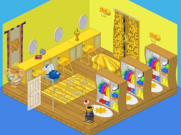
Here’s the original room. Not bad, huh? But I see what PJ means about the yellow. It is kind of overpowering. Let’s see if Hailey and I can do better.
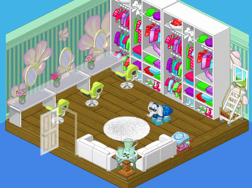
Hailey came up with this casual and relaxed soft green room. The Bloomin’ Room wallpaper, with its funky flowers gave us great starting point and the floor-to-ceiling Queen of Pop Closets offered a ton of storage. A couple of White Silk Sofas provide a perfect area for clients to relax while PJ puts together an outfit for them and the Lime Corinthian Dining Chairs and Frosted Top Dining Tables made ideal makeover stations with the Ballerina Wall Mirrors.
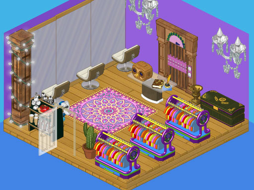
I decided to go a little more glam with my look. I painted the room a bold purple and threw in a funky Studio Loft Elevator, flanked by two Wondrous Wall Chandeliers. The Violet Persian Rug picked up the purples in the wall and elevator, while the Grand Empire Chest added a certain majesty to the space. I went for Dance Studio Long Mirrors and Cream Crescent Dining Chairs for my makeover stations. For storing the clothing items I chose three Stylish Clothes Racks, and I gave PJ a Glass Topped Dining Table for her work area. I also included a coffee station for clients to enjoy a beverage.
So now PJ has really got her work cut out for her, trying to decide which option to go for.






I like Hailey’s better but I like them both.
Once again I like Elwin’s room better. The purple makes the room look sophisicated.
I AGREE WITH RUCHIROCK THEY BOTH NEED PRIVACY! EVEN THOUGH THAT THEY MIGHT JUST BE DOING MAKE-UP THEY DON’T WANT OTHER PEOPLE TO SAY THAT LOOKS SO UGLY!! PUT I’M GOING WITH HAILEY’S
Hailey’s is not getting my vote, like most of the others. She is too girly and her rooms I don’t like. Elwin’s is MUCH more sophisticated and makes more sense. And I have never liked the bloomin’ wallpaper, so. Hailey’s a no, Elwin’s a go.
i like elwin’s better. hailey’s design uses colours that clash, and elwin’s is more cheerful and colourful.
Um, Elwin forgot to give PJ a chair!!!! HELLO? Um if you add a desk, she needs a chair to sit at it! Why does she need an elevator, or an old-fashioned notebook at her desk? You need to add COFFEE for the coffee station, and they sell it too! I like how Hailey made hers light and airy and modern, and I didn’t like how Elwin’s was dark, old-fashioned, mismatched, and thorny, (see that cactus near the bad storage space?) But one thing both of you forgot was to give everyone privacy to change clothes, and PJ had that in her first design. And why would you need an elevator??? That isn’t on the 2nd floor, right? Or do you need to take the elevator to go there?! I don’t like Hailey’s Square Swing Open Window, you need PRIVACY! Sorry, if you think I am insulting both, I’m just saying stuff that they should’ve made better, and improvements. For example, Hailey’s colors GO TOGETHER! Elwin’s look like a mismatch of dark colors and not so happy, while Hailey’s fits the season, Spring! So, I figure now, that Hailey can make stuff look new and modern in a good way, while Elwin can get carried away with more old-fashioned stuff. I’ve seen them use the Antique Toilet in some designs. Totally Elwin. So I like them both for different kinds of rooms!*~Ruchirock~*
hailey
I have to go with Elwin’s on this one. But I hope Hailey wins.
hailey, she has better taste
I like Elwins! Its very classy! I think Hailey”s was kinda pop neon, it was still okay but I love Elwin’s design!