What’s up, Webkinz fans?
It’s Hailey and Elwin back for another round of May Makeover Madness! Today’s challenge isn’t going to be easy – but it WILL be awesome! Ms. Cowoline gave each of us carte blanche (that means total freedom) to do whatever we wanted with a room at her school. Hailey decided she was going to try her hand at fixing up the staffroom. Me? I’m a cafeteria connoisseur, so I chose to makeover the caf. Check out the before and after shots of each, and then let us know who did a better job in the comments below!
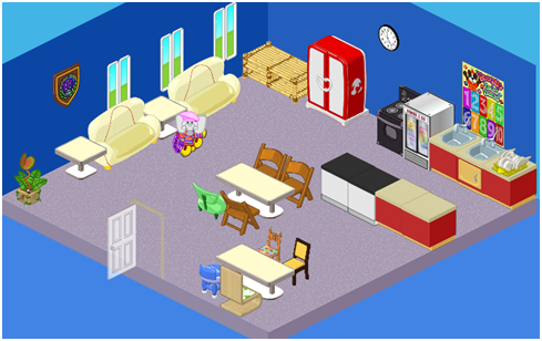
Hailey: I couldn’t believe this staffroom – it’s so dark and dreary! What surprised me even more than that was how many things were mismatched! Check out the chairs – only three are the same. And, as one teacher said, “You never want to be late for lunch – or you’ll get the little blue stool!” When the largest piece of art in the room is Booger’s times tables poster, you know your staffroom needs a major makeover. My goal was to create a space where teachers could come to meet, relax, mark papers, and talk. With that in mind, this is what I created:
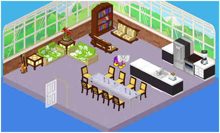
I kept the carpet because it was in pretty good shape. The kitchen needed a total re-work, so we added high-end appliances, and a blender and toaster (who doesn’t like toast first thing in the morning?)! I also created a few separate areas – a long table for eating together and having meetings, a book nook where teachers can relax, and a conversation area (complete with guitar for impromptu sing-alongs)! The biggest, most obvious change in this room is the windows. It was a lot of work, but having so many windows serves two purposes: to let light in, and to let the outside be the art on the walls! What did Ms. Cowoline say? “A-plus!”
Great job, Hailey. But prepare to be amazed. This is what the Kinzville Academy cafeteria looked like, PE (that’s Pre-Elwin):
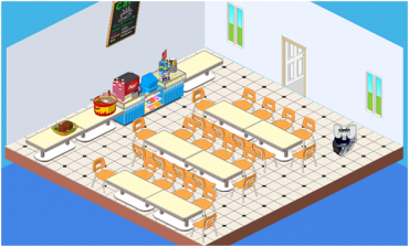
Elwin: When I walked in here, I was stunned – so many chairs! So many tables! So little art on the walls! This place is not inspiring in the least, and quite frankly, such a blah environment would make it even harder to choke down the already-questionable mystery meat. Let’s see if we can liven things up!
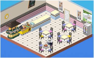
Now THAT’S better! Check out the awesome patterns (I LOVE that countertop – it’s so retro!) and the use of color. I love mixing and matching, so this room is ideal. My other favorite addition has to be the sushi bar – what student wouldn’t adore that? We upgraded the windows, added a juice fridge and put up a poster with a message I can totally get behind – “Let’s make the world a better place!” Well, I think we’ve definitely made the students’ world a better place, with this awesome cafeteria!
So, readers – it’s up to you! Who did a better job? Hailey or Elwin? Let us know what you think below!





Definitely Hailey this time. Good job to both of you!
In my opinion, Haily wins this time. The room looks great save for a few minor, and easily fixed details. Detail #1: The chairs surrounding the table do NOT match at all. #2: THere is a chair missing at the end of the table. Switch for matching chairs and add one at the end of the table, and this room would be great. Elwin, you do realize that now LESS pets can eat in the cafeteria at one time, don’t you? This rooms needs a lot more room for people to come in and eat, this isn’t exactly a tiny little school group you know! So, good job Haily! And Elwin, just so you know, the cafeteria slightly resembles my cafe room, which is supposed to be small. ;)
The chairs do match. You’re just seeing the back of some of them. I’m not sure why the one was left off the end, though. Nice makeovers on both of the rooms!
You’re right EllySilverStar. The tables can seat less pets in the cafeteria. I also noticed that the tables do NOT take up four spaces, so the spaghetti on one of the tables takes up all of the room on the table. So, even though there are four chairs around the table, only one pet’s meal would fit on it. Interesting…..
i like hailys better. it’s way better
I like Hailey’s transformation the best! Great job, Hailey! (Elwin, too!)
Kinda coolish…….I guess
can you a theme like that. :!:+:!:
Both rooms are cute! Good job, Hailey and Elwin!
Hailey, definitely. I love the new staff room. The cafeteria—it’s a school, not a cafe. The tables–lost a lot of space, so not as many students can be seated. It’s just not as functional. If I were a teacher, I’d just love spending time in the staffroom. Nice job.
I totally agree! I mean, does he really think they can fit all the classes in what 16 chairs? 4 tables? No way~it would have to be a one room classroom to have such a small space. Great job Hailey!
You are right. I love hte staffroom.
I like the third the best
WOW. you did a awesome job Elwin and Hailey. :cool:
wow cool! i TOTALLY wish i could design like THAT! wait, are any of those things estore?
Yes in the staff lounge there is the potted lily, and that’s estore, so you can tell that a few things will be ;]
They did a good job of making the before’s look bad and the after’s look great! I think the cafeteria is kind of impractical but it LOOKS better. Hailey’s is more functional, and it looks gr8 too.
I agree! The cafeteria doesn’t really look like a cafeteria, and Elwin lost four chairs!
Elwin actually lost ten chairs!!
Oh, Lyra, you’re right. I missed a row. :)
That makes it even worse!
If you lose that many chair in a caffitiria it’s not good cuz you can’t fit all the students!!!!!!!!!!!!!!!!!!!!!!!!!!!!!!!!!!!!!!!!!!!!!!!!!!!!!!!!!!!!!!!!!!!!!
OOOOOOH MY GOSH!!! Hailey, you and Elwin have to come redo my backyard!!!!!!!
They should make something were you enter you webkinz account and which room of yours is terrible and what it is meant for then each day instead of redoing the character’s room they could pick a random winner and redo that room on here.
Would be nice- but walls and floors *cannot* be changed in your real Webkinz account.
yes they can! you just have to put the new wall or floor into the room and it changes it
you can put wallpaper over wallpaper!
yea, one of my rooms has like ten layers of wallpaper
I think estore costs money HEY NICE ROOMS!
Yes great job re-designing!
I canged my mind BAD job re-designing!
6 things gymdog i have lots of estore items so I KNOW!!!!. OK!!!!!!?????
i like Hailey’s a lot but i like ‘em both
friend me i am: clobster6
both of those are AWEsome! But i give 1st place to Elwin-he has brighter colors! :) :)
I love them both-big improvement! i
Both are really good, but I like Elwin’s better. His seems more relaxing, whereas Hailey’s didn’t change my view of the room very much. Although the carpet did look brighter which kinda creeped me out for some reason…
I like Hailey’s design better because……..well it looks better.
my username is newwebkinzrock1
The first one was too not a cafeteria because it looks like a talking and playing room and a cafeteria! The second one was too oldish too bright too grandpaish. And the first picture of the change made by Elwin is the right one!
I think Hailey did better. She made it such a calming room, and a more functional room. Elwin did fine, but not great.