What’s up, Webkinz fans?
It’s Hailey and Elwin back for another round of May Makeover Madness! Today’s challenge isn’t going to be easy – but it WILL be awesome! Ms. Cowoline gave each of us carte blanche (that means total freedom) to do whatever we wanted with a room at her school. Hailey decided she was going to try her hand at fixing up the staffroom. Me? I’m a cafeteria connoisseur, so I chose to makeover the caf. Check out the before and after shots of each, and then let us know who did a better job in the comments below!
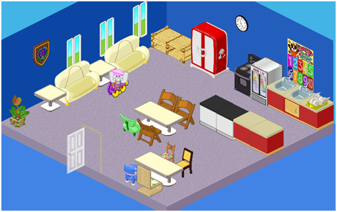
Hailey: I couldn’t believe this staffroom – it’s so dark and dreary! What surprised me even more than that was how many things were mismatched! Check out the chairs – only three are the same. And, as one teacher said, “You never want to be late for lunch – or you’ll get the little blue stool!” When the largest piece of art in the room is Booger’s times tables poster, you know your staffroom needs a major makeover. My goal was to create a space where teachers could come to meet, relax, mark papers, and talk. With that in mind, this is what I created:
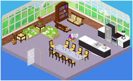
I kept the carpet because it was in pretty good shape. The kitchen needed a total re-work, so we added high-end appliances, and a blender and toaster (who doesn’t like toast first thing in the morning?)! I also created a few separate areas – a long table for eating together and having meetings, a book nook where teachers can relax, and a conversation area (complete with guitar for impromptu sing-alongs)! The biggest, most obvious change in this room is the windows. It was a lot of work, but having so many windows serves two purposes: to let light in, and to let the outside be the art on the walls! What did Ms. Cowoline say? “A-plus!”
Great job, Hailey. But prepare to be amazed. This is what the Kinzville Academy cafeteria looked like, PE (that’s Pre-Elwin):
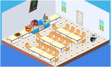
Elwin: When I walked in here, I was stunned – so many chairs! So many tables! So little art on the walls! This place is not inspiring in the least, and quite frankly, such a blah environment would make it even harder to choke down the already-questionable mystery meat. Let’s see if we can liven things up!
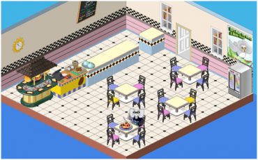
Now THAT’S better! Check out the awesome patterns (I LOVE that countertop – it’s so retro!) and the use of color. I love mixing and matching, so this room is ideal. My other favorite addition has to be the sushi bar – what student wouldn’t adore that? We upgraded the windows, added a juice fridge and put up a poster with a message I can totally get behind – “Let’s make the world a better place!” Well, I think we’ve definitely made the students’ world a better place, with this awesome cafeteria!
So, readers – it’s up to you! Who did a better job? Hailey or Elwin? Let us know what you think below!





i want the toaster and the guitar in the w shop. there should also be a salad bar. i would love to make a cafeteria with a salad bar!
I like haileys alot better and by far and not just because she is a girl and i am a girl i like hers more.
I think Haily did better because she gave life to the room. Th other one was just changed.
I think Halley did the best job personally…….
I totally think Hailey did awesome! Everything matches, and it’s just beautiful! Elwin, on the other hand, had a little too much mix-and-matches! I LOVE HAILEY!!!!!!
I love it! (:
Great job i love it!
I think Hailey’s design is the best. I really like the large tables and guitar stand. Elwin, I think the cafe was little too mismatched.
I think if the 4th one could fit one more table. i mean the lack of seats could be easily solved. but the before, all the seats were crammed together, not as easy to move around. by the way the tables in the third pic couldn’t take more than half of the trays if there was a webkinz for every chair, so why would that be a new problem for the 4th pic
Definitely Hailey beacause Elwin’s looked to old school and was not very open.