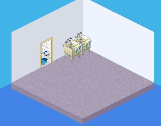
So I guess this whole baby thing is turning out pretty well. Our new house is pretty cool, but the best thing about it? I get a whole room JUST for making crafts!!! How awesome is that? There is this room in the basement that used to be the laundry room before they moved the laundry room upstairs. So it’s even got a couple of sinks which is perfect.
And you know what else? Because my mom and dad hired Hailey and Elwin to decorate our new house, they are going help me decorate my craft room too! How many kids get to have professional designers come and design their craft room?
I am so pumped! Especially with all the cool pieces from the Creative Studio Theme that are in the W Shop!
Hailey said that we could try it a few different ways and then I could decide which one I liked best, so Hailey designed it one way, Elwin did another design and then the three of us worked together to come up with a third design.
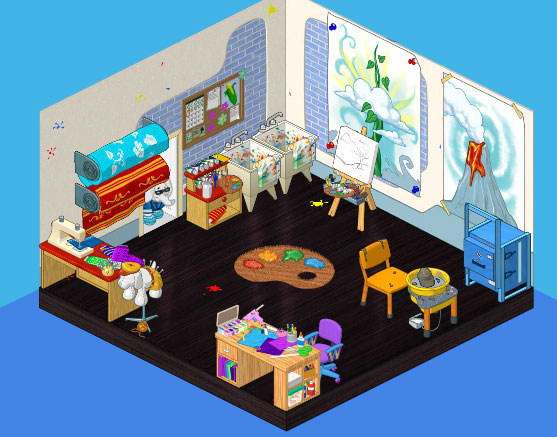
This is the room that I helped with. I really love the new Creative Studio Theme so I wanted to use everything! I think the blue and white walls look so funky. We created several different work stations in each corner. We decided to put the Art Easel and Station by the sinks, and then in one corner created a Pottery area with the Potter’s Wheel and Kiln Oven. In the opposite corner we used the Fashion Sewing Machine and Fashion Mannequin, and Crafty Kimmy’s Work Station makes the perfect desk for me.
And here is what Hailey came up with:
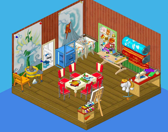
Hailey wanted to warm up the room a little because basements tend to be pretty grey and cool. She also thought that I should have a big crafting table in the middle, where I could work with my friends when they came over. That’s a great idea! Around the outside of the room she placed my crafting supplies and work stations. In one corner are my Fashion Sewing Machine and Fashion Fabric Rolls, in another corner my Art Easel and Station, and there’s a Potter’s Wheel and Kiln Oven on the other side. I do think it’s cozy and inviting, don’t you?
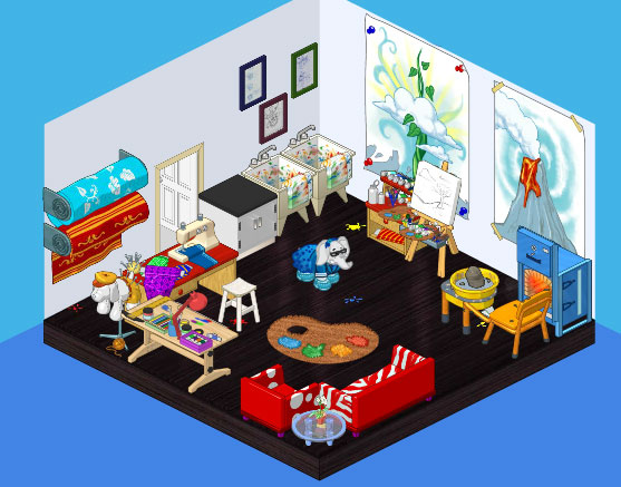
Elwin really liked the cool blue of the walls before. He said that the light walls made a great background for my artwork and gave it a really gallery feel, especially when combined with the Creative Studio Flooring. Elwin added a comfortable seating area where I could hand out with my friends, using the new Music Note Sofa and Chair from the Creative Studio Theme. He also added a cool focal point with the Art Paint Palette Rug. I like the feeling of space created by the bright walls and the open furniture arrangement.
But now that the designs are all done, I just can’t decide which one I like best. What do you think?







I like the second one better. Add me. username:Valinsia
Overall I like the first one. I would take the shelves from the second one and the couches from the third one. Your choice Roberta!
I like Roberta’s the best. Hailey’s second. Elwin’s third. Elwin’s is just too cramped. I mean, in the corner over there with the sewing machine and desk and stuff. Just too crowded. I like rooms to be organized.
I personally like the first designed craft room. If it were MY craft room, of course I would want to use everything. But I wouldn’t really have my own craft room– that would be weird, and I’m not so into crafts where I would need one. I am trying to redecorate my own room, though, with JB!! :D
I like the first one the most!!
I like Elwin’s the best! it looks just like the theme in the W shop! hve fun decorating rooms Roberta! >>j3gnight2011<<
I like the 3rd one the best! Elwin’s is good too, but Hailey’s room isn’t the best.
elwins no totally, um probly the one they all desined
i like them all but i have to say that design 1 is my favourite
Room 1 is tops!!! Room 2 is second!!! Room 3 is third because it’s too crowded!!!