Hailey: Hey all! Hailey and Elwin here with the first of our redecorating challenge articles.
Elwin: That’s right, Hailey. All week we’ll be putting up our latest projects to see whose room designs Webkinz Newz readers like better.
Hailey: The first room we tackled was the Employment Office Break Room.

Elwin: Can you say seventies shabby? That’s what I thought when I first saw it. Ugh. The room was just such a jumble of mismatched furniture.
Hailey: Tabby told us that most of the furniture had come from secondhand stores, or from friends. She got it when she first opened the Employment Office, and she just hadn’t updated the room in years.
Elwin: Enter the Designer Elephants! Hailey and each took a stab at creating the new and improved break room. Here’s what we came up with:
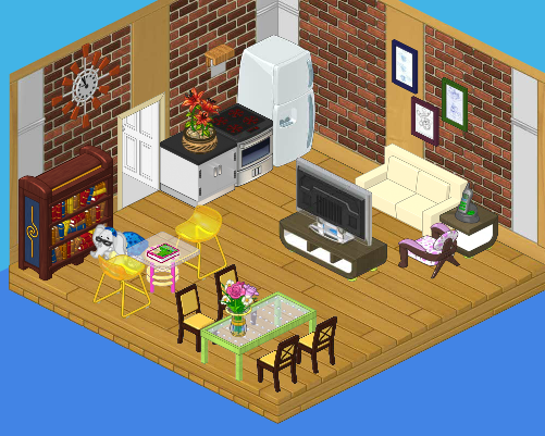
Hailey’s Design:

I decided to create a serene, restful space for the employees. We’ve got a plush couch with a big screen TV, a dining area where they can eat lunch, a reading area for relaxing, and a top-of-the line kitchen. It’s functional and stylish. I’d like to see Elwin outdo this room!
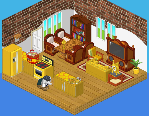
Elwin’s Design:

Interesting that we both used bricks in our wall treatment! I guess that comes from being twins (or just having good taste). Although I like my sister’s design, I have to say – mine is far more interesting! The gold really makes the room pop, and the heavy wood balances the brightness perfectly. Adding windows opened the room up. The little accessories really make the room feel like home.
So what do you think readers? Which of the Designer Elephants created a better break room?


Hailey
Sorry, Elwin, but I think Hailey has this one nailed! Yours is nice, just a bit over the top for a break room.
No offense Elwin, but I really like Hailey’s design better,because it looks really smooth and relaxing.
I like Elwin’s better. The eating space is closer to the kitchen than in Hailey’s. No more “crumbs across the kitchen.”
I prefer Hailey’s, however, they both lack something EVERY break room needs…LOCKERS! Breakrooms are for everyone, and they need a place to keep their “stuff” while they’re on the job. Sometimes, if someone has an appointment after work, they might need a change of clothes. Where can they keep it? Lots of people ride public transportation and can’t keep things in a car. Every good break room needs lockers. At least the old room had lockers. Why did you take them out??
ps to my earlier comment. Both left out lockers for the employees, and Elwin forgot to put in a phone!
Greenie goes green!
I prefer Hailey’s room design. Its more open (I don’t like being crowded), but it could really use some windows.
Good luck to you both.
Greenie goes green!!!!!
To be truthful; I’m not crazy about either of these! The original room was mismatched, but it had all they needed, including lockers for storage. Neither Hailey or Elwin gave them lockers. The original room just needed for the furniture to be in complimentary styles, colors and patterns with nothing too bright or heavy. Chrome appliances, simple furniture and an uncluttered, functional layout. Also, use a serene green color rather than brick. Any lighter color paint or wallpaper would have given a fresh and restful feeling. I usually love the elephant’s re-dos, so no offense. They are awesome, but this wasn’t their best work.
2 more for hailey =19 votes vote for her! I got to get off for the night see u guys tommorrow afternoon for the final count up!
I like Hailey’s design better because it looks more organized and professional since u r waiting to do a job :)