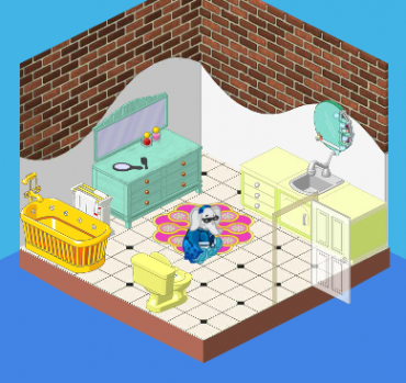
Hailey here with another great redesign at the Bryn Mansion. Today we tackled the bathroom. The old bathroom was really outdated. Not only were the colors completely unappealing (the bathtub made my eyes hurt), but there was a total lack of style to the room. I mean those counters? Really?
So Elwin and I worked our magic and this is what we came up with:
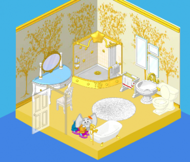
Ah! It’s beautiful! I love the gold and white – and the punch of turquoise works just perfectly. We added the stylish mirror arrangement and fluffy white carpet as accessories. The shower is oversized and extremely fancy, and the bathtub is much easier on the eyes. Tell us what you think of this redesign, friends!





Verry Nice
So pretty, you guys!! Great job!!
I wish I could have that shower!!!!!
i…………………………………………… LOVE IT!!!!!!!!!!!!!!!!!!!!!!!
I love the new look! What theme is that? I want the wallpaper in my webkinz room.
Even though I don’t really like rooms full of eStore items, this one is actually really nice. ~(*PL4Ever(*)~
Hi how do yuo get that rom thing or is it just for the pet of the month or the members?
Honestly, on all of these rooms, I prefer the old design.
My goodness! It’s beautiful! Care to do my house next?
Oh cool!!!!!This is probably my favorite makeover they’re done on the manshion!!!! Except I think a more turquise coloured towel rack would much suit it. GREAT job over all!!!!!!!!!!!!! LOVE IT! -mycatGinger >-^-^-<