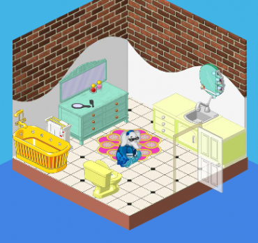
Hailey here with another great redesign at the Bryn Mansion. Today we tackled the bathroom. The old bathroom was really outdated. Not only were the colors completely unappealing (the bathtub made my eyes hurt), but there was a total lack of style to the room. I mean those counters? Really?
So Elwin and I worked our magic and this is what we came up with:
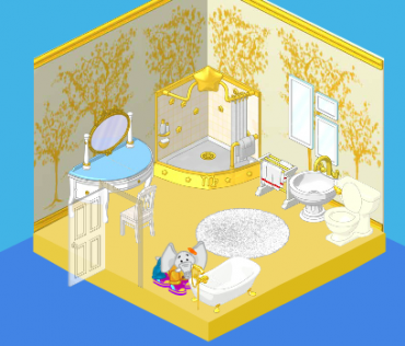
Ah! It’s beautiful! I love the gold and white – and the punch of turquoise works just perfectly. We added the stylish mirror arrangement and fluffy white carpet as accessories. The shower is oversized and extremely fancy, and the bathtub is much easier on the eyes. Tell us what you think of this redesign, friends!





more turquoise, it clashes with the gold and the gold is too much but if you put more blue it would all be fixed
Wow! Does anybody know where that wallpaper comes from? I want it for 1 of my rooms!
Wow… the old room was awful! I’d hate having a room like that in my house! None of those colors really match. But WOW! The redecorated one is awesome! The gold makes it look extravagant and luxurious, the spacing of the furniture and the clear floor makes the small room feel a bit bigger, and I LOVE the shower with that wallpaper! The Bryn’s must adore it. I love designing rooms myself, but is there any chance I could hire you as a consultant?
Im gonna make my bathroom look like that ;)
very bright…~~~
very bright…
uh… why is the door in different places??
Whoa….It looks awesome but the red in the towel seems a little out of place,but I’m always overly critical (LOL) ~Random reader
How did you do that?!? Can you do that with MY room?