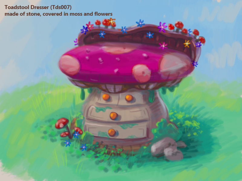
You voted that the Toadstool theme should be the next room theme to be released in Webkinz World. We’ve already showed you the first 4, and now here’s a look at 3 more concept drawings for furniture to be included in the theme:
Hailey: “I love how vibrant the colors on this dresser look!”
Elwin: “And all of tiny flowers and mushrooms growing out of the top! It just feels so magical!”
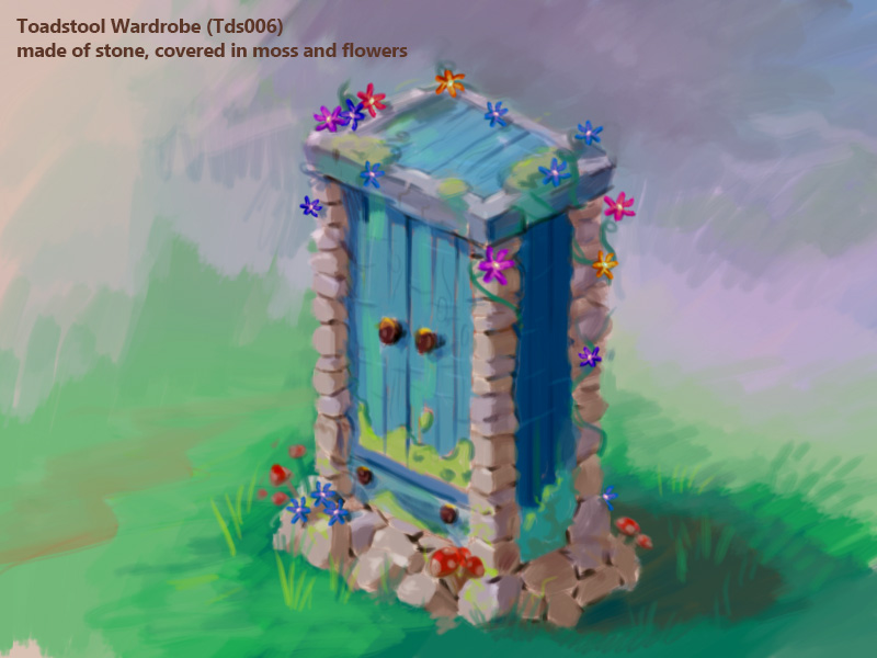
Hailey: “Now THAT is one sturdy-looking wardrobe!”
Elwin: “You said it! What a wonderful combination of stone and wood! This wardrobe looks like it would keep your outfits safely tucked away!”
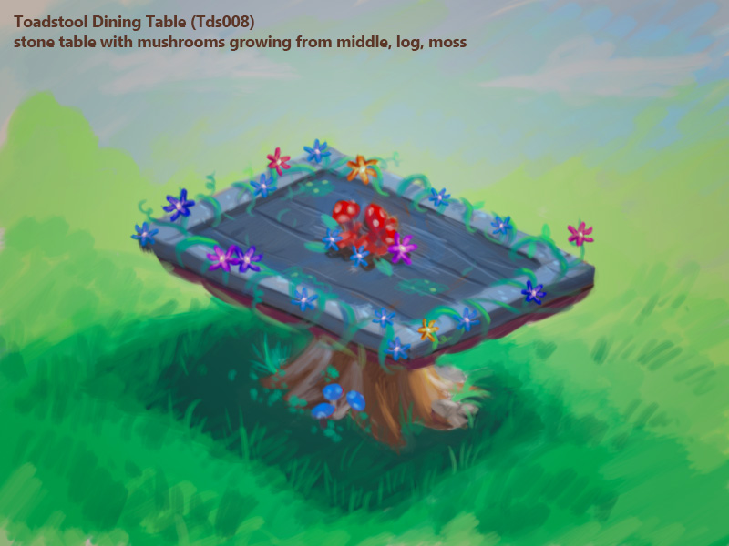
Hailey: “This dining table is delightful! I especially like the colorful floral centerpiece!”
Elwin: “It almost feels like a little doorway to a hidden world! This is great!”
What do you think of these items? What would you change about them? Do you have any name suggestions for them? Let us know in the comments below!






I don’t care much for the dresser and it is a bit suggestive with those mushrooms growing where they are.
I think the table doesn’t go well with the whole theme because if you look at it doesn’t look like it goes with the theme. It’s all stone with hints of flowers and mushrooms. I think that if the table is a coffee table (I think it is) then it could be make out of a tree stump (A fairly big one) with the rings in it (You know inside a tree there are rings in the wood and 1 ring = 1 year) and moss with mushrooms and little flowers. The legs could be made of stone. I think that the wardrobe needs some changing also. TAKE AWAY THE GOO!!! If a 5 year old is playing and looks at the theme he or she will probably think “What the world?” and probably not get it. Other wise I think it’s good. But maybe change the color? The blue just doesn’t go with the theme. Maybe have the outline of the wardrobe be rocks and the doors wood. Also maybe make the doors have moss creeping in the corners of the doors. Maybe make the doors the color of red berries. “Call it Berry Go To See You Wardobe” Just suggestions! ~MissAmerica5091
Hello everyone! I am sooo glad that this second concept drawing for the toadstool theme came out finally! I was so excited when I saw it, before I even looked at the concept drawings! Now, to answer the article’s questions: What do I think of these items? Well, for the Toadstool Side Table, I like it! It’s not my favorite of the whole batch, but, I still like it! For the Toadstool Wardrobe, I like that as well! It might be my favorite of all three, if you make a few little changes which I will get to soon. And finally, for the Toadstool Dining Table, I like that as well. I think I like all of the items actually! :) Though I would like it to be more toadstool-ey. Now, what would I change about them? Well, I think for the Toadstool Side Table, I like the general look of it, the color of it, and everything, but, I would try to make the moss that is covering the side table look more like real moss in the finished product. you know, more, fuzzy-like, and a darker green too. I would try to make it look more like it is real one, because that would just be better, in my opinion, and, it would not look so much like that is dirty slime on the drawers there. And, I would not make it be drooping off the sides either, because that make it look, also, like it is not very clean. But, I’ve spent too much time lingering on moss, so, let’s move on. Um, also, I would not have small toadstools growing off of the side table, because, it is supposed to be a toadstool (or at least shaped like one) itself! You know? But keep the flowers. They look pretty there, and, that is the one thing that almost every item so far, has, so it kind of ties all of these items together really nicely. Also, I would make the side table top be a bit more round, like real toadstools, looking almost kind of bouncy to the touch, and I think it should be like a real toadstool, not be made out of wood, like the description says it is. But don’t change the color. That looks pretty well there. Just make it a little bit brighter. Also, I would add just a few vines to the top of it, near the wildflowers. I just thought that it looked almost like it was needed there. Anyway, I think that’s it, so, I’ll just move on now. For the Wardrobe, I would also try to make the moss look more real, and not so much like dirty green slime. More fuzzy and textured, like I described when talking about the side table to this theme. I think the colors to this are pretty well coordinated with the toadstool chest from the other set of Concept Art, which is really cool, as with the table, so, don’t change that. I would add a little bit more flowers and vines to the sides where the rocks are on the wardrobe. I think that when you open up the wardrobe, it should have kind of like a little glow coming out of it. That would be nice. You could maybe make one or two fireflies fly around, so you could make the wardrobe animated to do that, that would be really cool and pretty. It would be cool if maybe a little bit of music played, and when you click on the wardrobe it shows it slowly opening, maybe with a little creak, and you hear that little bit of magical, smooth, pretty music for a few seconds. That would go nicely with the little glow that I suggested earlier in this comment. Just a suggestion, but, I would make this wardrobe be able to hold a lot of things, maybe, eight, or ten. That would be nice! Finally, for the Dining Table, you should make the color of it just a little bit lighter. If the little bunch of toadstools and wildflowers in the center of the table was supposed to be a centerpiece like Hailey said, then I would make the toadstools be a bit bigger, and make there maybe be three, bigger toadstools instead of only two, and I would add just a few more wildflowers, if you make the centerpiece bigger and with another toadstool, like i just suggested. And, if those little green sploches were supposed to be moss, then, like all of the other items, I would definitly try to make the moss look more real in the finished product, more furry and textured, like I said earlier in the comment for the other items. I agree with Elwin on how the table looks alot like a door leading to a hidden world and because of that, I got thinking and I think that when you double-click on the table like a bright light should surround you, like, cover your screen, and you should hear a sound kind of like ‘SphwoooOOO’ and then it should take you to a new game that you could create special for that item and only in that theme. It could be like, maybe, making your pet jump on bouncy toadstools and mushrooms of different colors to make any music you choose in free mode, and then, in challenge mode, you could have to follow patterns, and then when the pattern that you followed is put together, it could make whatever music you make for each level. And the same (except the players would be making the music) for free mode. You can either include a trophy or not, your choice, GANZ. I like the wildflowers, and vines, and toadstools, and the fact that the bottom of the table is a tree stump. i was, at first, a little dissapointed that the theme seemed to be loosing it’s nice, grassy, mossy, more toadstool-ish feel, but the stone is OK too, because it kind of goes well with the Toadstool Chest from the your previous set of Concept Art that was released. Anyway, do I have any name suggestions? Hm, I’m not sure. Maybe, you could call the side table the Beautiful Bouncy Side Table, for the Wardrobe, hm, I’m not sure. I need to think about this for a little bit, just give me a moment….well, maybe, the Spectacularly Stoney Toadstool Wardobe, or the Magical Fashions Wardobe. And for the Toadstool Dining Table, the Secret Entry Dining Table. Oh! And I think that you should make the wallpaper (which was not released yet, but I just had an idea) you should make it be animated, have little fireflies flying around, and trees (if there are any) have their leaves be swaying with a little bit of wind. and it should have little outdoorsy sound to it, like crickets chirping, and wind blowing. Just an idea. I like each of these items a lot! I have a few suggestions for things you could add: a bouncy toadstool trampoline (it would be a toadstool itself of course) a patch of just a lot of toadstools, and little toadstool chairs. A mossy rug with wildflowers and small toadstools growing on it would be nice too. I hope you liked my suggestions! It took me soooo long to write this whole comment!! :) Thank you for reading such a huge comment, and I hope that I did not scare everybody away with the length of it! ;) LOL! I really like these concept drawings and can’t wait until the next set of concept drawings are released. GANZ has such talented artists! :) Good job guys, keep up the good work! And please release the next set of concept drawings as soon as you can! :D Please reply if you liked my ideas, I have many more, but this comment (or should i say article) was so long already i thought that I would wait and see if you all wanted more. Happy 4th of July!! :) PS: Micheal, what do you think of my ideas? I thought I would ask for your HONEST opinion since you are sooo great at making such awesome rooms! Keep up the great work on those! Can’t wait for the next Let’s Build video! :)
Wooooooooah, that was even longer than I thought it was going to be!!!! I was right, is WAS an article! LOL! :0
Oh and, please GANZ, don’t make any of these items deluxe, or estore, and please take my suggestions and make this the most awesome room theme EVER! :D
I like your ideas prprprprp they are very detailed and I do agree about the wardrobe. It should be magical. You have lots of good ideas, I can tell.
Aw, thanks delephoxlover123! I’m glad you liked them! I have some more ideas (as I mentioned in the comment above) would you like to hear them? (it’s totally fine if you don’t!)
Oops, that was a Toadstool Dresser, not a Side Table. Sorry. just make that the Beautiful Bouncy Dresser! OK?
I am in awe of your imagination! I think the goo which does look like slime should be darker green to make it look more lifelike. Have you noticed how much these comments look like the old forum pages with pictures added? These are really special! We’ve seen moss growing on stones in the woods as well as on tree trunks but only where the trees grow thick. Hope all the people with imaginations continue commenting and have a wonderful Independence Day and Canada Day. Hope also that the wshop themes become more inclusive. Allowing the pieces to be used in any of the rooms is really good too. ♥♥♥foxpaws♥♥♥
I guess you like my ideas? :) I’m glad of it if you are! And thank you for what I think is a compliment on my imagination! :) Have a great Sunday everyone! (and yes, these do look alot like the forums. I hope they open them up soon. I started a forum a little while ago when i forgot GANZ is not posting them. I hope it works soon. It was about figuring out Boiled Wyvernacle. I wanted everyone to post their hunches, and their fails. I would have tryed out each and every hunch so no one had to waste money!-I’ve got plenty-) :)
Awesome ideas prprprprpr love them all!~playnowpuppy☺☻♥♦♣♠•◘○
Thanks!! :D
hope the theme is inside, outside & Treetop too ,that would be amazing ,& the gooey green stuff is unnessary & KINDS GROSS , THE DRESSER WOULD LOOK BETTER WITH OUT IT. & When is this Theme coming to the WSHOP? i need to know so I can save up some KC
These designs are well done although with the dresser I think the little backing should be removed because it looks like a counter unless it’s going to be 2 by 2 or 1 by 2. Also it would be really cool if there was like a well for this theme of like a playful item like a slide or hide and seek thing. Otherwise like I said before awesome job ganz.
Maybe if the backing on the dresser was actually redone to become a mushroom shaped mirror instead , that would be cool
The wardrobe and the table look really nice but the dresser could use a little work in my opinion.
Please tell me these won’t only be for deluxe or on the estore items. These should be for everyone. They are that cool.
Eeeexactly!! :)
Oh and, could you read my comment below and then reply and tell me what you think of my ideas? And tell me if you would like to hear my other ideas! Thanks to everyone who does! :)
don’t worry emotkdgirl kinz said the theme would be none deluxe and E-store☺☻♥♦♣♠•◘○ hope this helps :)
Can you get rid of that wierd green moss stuff? It just looks like a bunch of yucky not wanted goo to me, and I would not get the room theme. Now I am sorry I voted for it.
Yeah, I asked GANZ to make the goo/moss look more textured, less slicky, and yucky like goo, and more real in the finished product so, I hope they do it! Oh and, read my comment below please and tell me what you think of my ideas! :)
Here is what I think the items should be named. Dresser: Magic Mushroom Dresser. Wardrobe: Set in Stone Wardrobe. Dining Table: Hidden Doorway Dining Table. Those are my names, hope you have a great day.
Nice! :)
awesome☺☻♥♦♣♠•◘○
umm i dont like it at ALL!!
Would you like it with my suggestions? could you read my comment below on this age (you’ll know it easily, it’s the LONGEST comment on this whole page not to mention comments section!) But please reply and tell me if you like my ideas and if you want ot hear more! :)