Heya Webkinz Newz readers! You’ll never guess where I was the other day.
Give up?
I was at Dr. Quack’s Office! I had a terrible sore throat, and fortunately the good doctor was able to fix it (hooray for peanut lozenges!). Anyway, while I was there (in the waiting room, then in the exam room), I noticed something…the place was a design disaster! Not only did Dr. Q need some serious organization, his decorating looks like it’s at least thirty years old – seriously, what doctor’s office has brownish-orange walls? Fortunately, I happen to have an eye for design, so I offered my skills.

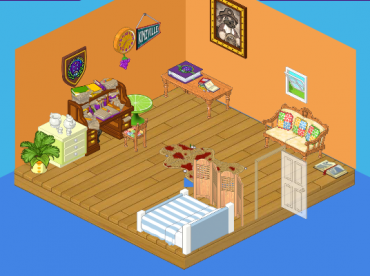
This is the ‘before’ picture – the walls aren’t a great color, Dr. Quack’s desk is a HUGE mess (hello, storage space) and there are too many random things on the wall. The worst offender of all, however, is the rug in the middle of the room. When I asked why Dr. Quack liked it, he said, “It’s eclectic!” I rolled it up and put it into storage.
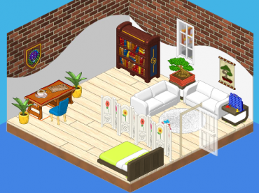
This is the after shot!

Note how clean and pretty everything looks! The walls are so modern and the floor is spotless. We’ve moved the books to a shelf, cleaned up the leftover papers, added a neat bonsai plant and a print (very relaxing for nervous ‘Kinz in the waiting room), a fun game to play while you wait, some plush couches and an up-to-date examination table. When Dr. Quack saw the new look, he had one thing to say: “Wow.”
Mission accomplished!


To me this room-designer dude sounds like a drama queen. I quote, “Not only did Dr. Q need some serious organization, his decorating looks like it’s at least thirty years old – seriously, what doctor’s office has brownish-orange walls? Fortunately, I happen to have an eye for design, so I offered my skills.” He sounds EXACTLY like one of my classmates…
I liked the first model better.
Thanks for doing that!
that isso cool!!!!! how do you enter May Makeover?????????? somebody please tell me!!!!!!!!!!!
Doctor offices should NEVER have couches for waiting patients. Who wants to have to sit with sick people you don’t know? It might be OK for people who go in there together, like parent and child, but that’s not usually the case. I don’t like what the decorator did. There should be individual chairs.
i disliked the first one:( The secound one was off the hook big time:)
WOW!! thats is a AWSOME docter office one time i had a house sortaf like that!!!!!!!!!!!!!!!!!!!!
It looks great! Does Dr, Quack like it? Great design! :)
I HAVE ONE THING 2 SAY WWWOOOOWWWWW IT LOOKS OK
to bad MY doctors office looked like that! lol :D