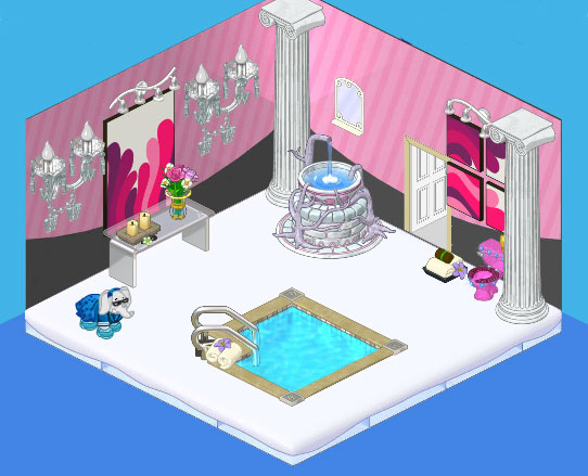
Hi readers! It’s Elwin. When Hailey and I set out to design the bathroom for our new studio we wanted something that would really wow prospective clients. Chances are we won’t be taking a lot of baths while we’re working, but we wanted clients to see how impactful a well-designed bathroom could be.
We decided to go with an elegant yet modern theme in shades of pink. We started with the Trading Card Condo Wallpaper. It really stands out against the icy white First Snow Flooring. The Stress Soaker Hot Tub makes a stunning focal point in the room while the Whimsical Water Fountain is our creative alternative to a regular sink. Along with the marble columns it adds a very regal feel to the room. We added a feature wall with a pair of crystal chandeliers flanking a Pretty in the City Painting, set over top of a Frosted-Top Dining Table.
I think anyone would feel pretty special to have a bathroom like this. I know we sure do. And I hope our clients feel the same.


I hate to say this, Haley and Elwin, but you forgot a SINK and the mirror is behind the fountain where no one can see it! I guess you’re supposed to go climb up the fountain to wash in it, and while you’re up there have a look in the mirror??? If this is the kind of designing you do, I sure wouldn’t want you in my house. Yes, it’s a pretty room, but rooms need to be functional.
the fountain is the sink
That’s a cool bathroom! The best I have ever seen! keep it up! >>cat lover cathouse2
It a pretty cool room……… I like it!!!!
The toilet first off is ugly like everyone is saying. The items in the room are cool, but don’t go well together. The snow floor just seems weird to me in a bathroom.
One of the things that I like about this room is that it shows that you can do really well in a small space. Most of my rooms are 10×10; this room is 7×7 and still works very well. I do agree, though, that a privacy screen for the toilet, as well as a different (more elegant?) toilet would be nicer.
symm0nne – Do they make a more elegant toilet? Maybe they just need a screen. And I am wondering if the column by the toilet could be removed to make it less “over powering” – what do you think? I also like trosser’s idea of putting the towels by the fountain – maybe on a small spa table. It is still an amazing room. All the best! MDIChickadee
I like it alot too, though I would probably have chosen a different flooring. Great job! ~QueenVet~
It is a pretty room – I would have liked the toilet to be screened from the rest of the room somehow and am also curious (like steeler86fam) about how one washes one’s hands (and maybe freshens one’s face?) in that fountain. The columns both add and detract so I guess they are neutral to me. Nice room. Incredibly different. All the best! MDIChickadee
I think it would be cool to wash your face and hands in the fountain. The towels should be over by the fountain though instead of by the toilet.
trosser – you are right – the towels need to be by the fountain! That would make it MUCH better! And a screen for the toilet – or maybe one of those spa waterfalls!! All the best! MDIChickadee
I agree that the toilet is ugly in this room. Also, the columns are too “in your face” for the relaxing atmosphere of the bathroom with the hot tub in it. SHould have a small table near the hot tub, too. AND, how do you wash your hands in that fountain ?
I agree, the toilet is kind of ugly, but I really like everything else. This is my favorite room so far! Remorso11
I love everything but the toilet,GREAT JOB!
I love the room!!!!!!! But the toilet is too small. But still a great room!! ~Hello Kitty ROX! ^.^
Pretty cool! @Hello Kitty ROX Can I friend you? I’m sugarsnapper12 on Webkinz thanks! -PHN :D :D
That is the weirdest bathroom i’ve ever seen. ~LoveAndWar~ :D
IT’S AWESOME!!!!!!!!!!!
Ok, I will add you! My username is icecreamcoone. ~Hello Kitty ROX! ^.^
Thats a bathroom???????? WOW! Thats the coolest bathroom Ive ever seen! Mine is kinda small, the other one is smaller, and the one in my parents room is the smallest. I wish I had a hot tub andspa pool like that! Once, while caroling, I had to use the bathroom in these peoples house, and they had the most FANCIEST bathroom ever! I would put room devider by the toilet, BTW. ;) ~KK♥
Woah…, this room is literally ‘awesome’. I love the fountain and spa items. Keep up the good work! ~ SugarComet***
i agree with u on that….can u imagine… :) and it is super nice but the toilet ruins the room 2 me.. u know? *stylegirl12*
I LOVE it!!!!! :D I wish that was my bathroom! The tub is awesome, too bad it’s estore LOL
That is so cool! You elephants did another JOB WELL DONE! ~Phoenix Wind~
the toilet’s a little outta place, but that’s all. other than that, i think the room is SPLENDIDLY MARVELOUS! *the ultimate cookie lover, cookie crumbs*
It’s the most beautiful bathroom I’ve ever seen! LOL! I really like those chandeliers and the hot tub is neat. I saw a hot tub at the Curio Shop but it was WAY to expensive for me to afford. *The Stargazer*
Agreed! This is just lovely, but a white porcelain toilet would have been better, I think. The pink thing in the corner just looks out of place. Otherwise, I wish this were MY bathroom!
That bathroom is so cool! Your friend sarahandlacey! :lol: :mrgreen: ;-) :-) :roll: