The Webkinz Newz community recently chose the Treat or Treat Street theme as this year’s Halloween room theme and today, I am excited to show you the first set of concept drawings!
I really like how this theme is turning out, but there is still some time before the artists start modeling each item in 3D. This is your chance to leave feedback in the comments section below. Tell us what you like or don’t like about each item or how you would make them better. We will be reading each comment carefully and take all your suggestions into consideration before making the final items.
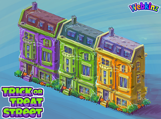
Here is a look at the homes that will be included in this theme. You will be able to add the homes to the border of an outdoor room to create the feel of a neighborhood that is decorated for Halloween. There will be three different homes, each featured in a unique color. You’ll be able to mix and match colors or set up a neighborhood using only one. Do you like the colors we used?:
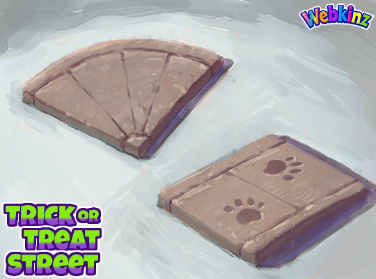
We added the road tiles that you could collect playing SPREE to the W-Shop and now you’ll have sidewalk pieces to match them. I think they will be perfect to use as pathways leading to each house as well. The paw prints are a nice touch but you don’t need to use them if you don’t like. The sidewalk tiles will change slightly when you rotate them in your room:
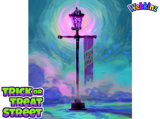
This lamp post is beautiful and I love that it will glow purple when it’s turned on. The Trick or Treat banner is also the perfect touch. What do you think?:
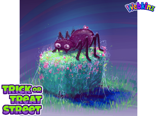
The last concept drawing I have to show today is a hedge that is decorated for Halloween. The concept drawing features a giant spider decoration resting on top of the hedge, but it will change with each rotation, giving you lots of design options:
Don’t forget to leave a comment letting us know what you like or don’t like about each item. You could have a hand in how the final pieces will look! We will be taking every comment into consideration.
Stay tuned for some more concept drawings coming soon. I plan on posting them on Saturday, Aug 17th.





I love the theme!!! I think the house designs should vary, though, and not all be identical.
i love the first one!!! but would you get candy out of it like a dispenser? cause that would be awesome!!!!! the rest are cool too
LOL, great idea! XD
I love this idea!
I was happy this theme won but was expecting more pumpkin decor. We have so many dark and spooky themes. I was hoping for more cheerful theme.
I’m gone for 2 months and I come back to A THEME I’VE BEEN WANTING FOR YEARS!!! YESSSSSSSSS!!!
Welcome back! I wondered where you’d gone! I am glad that we held the place together while you were away. LOL!
I like the looks of this theme so far. How about adding some skeletons with google eyes, or cheeky grins for decorative wall hangings on the homes, light poll, or holding a jack-o-lantern?
totally
Liking the concept drawings for this theme. I have one suggestion for the houses; please make them that our pets can sleep in them! This would really help out with those of us who have soooooo many pets! Thanks!
Really liking how it looks so far! Great job, you guys! ^-^ I’m really looking forward to getting this theme once it’s released!
I love the idea some players have posted of pets being able to interact with the houses! It would be awesome if, for Halloween, at least, pets could ring a doorbell, call “Trick or treat!” and get a treat. Wouldn’t that be fun? I’m already excited for Halloween!
Sorry, one more comment on the theme–I’d love to see more bats and cats and fewer cobwebs…but I’m really liking the looks of this theme so far!
I voted for this theme because I liked the look of the concept art for the park bench – it looked like it belonged in a neighborhood park that residents had taken the time to decorate for the season. I like the brownstone houses but perhaps they could be rotated to create some variety in the main design. PLEASE – consider changing the colors – the purple, acid green, and orange colored fronts are are clashing. Those were the colors of last year’s goblins and I feel they just don’t transfer well to a neighborhood street. The concept art of the bench and the row of houses don’t seem to be on the same page of design. I envisioned putting the houses along the two outer walls of a room with sidewalks leading to each doorway. I planned to use the inside room area to create a park with a Halloween Party that pets could attend when finished with trick or treating. The WKN Never- Ending Candy Bowl would be perfect and there’s lots of items from past Fall Fests. Of course, everyone would be wearing all the awesome costumes I’ve collected. I’d scatter plushies of Ms Birdy and Arte and all the ‘Kinz kids and, of course, a plush of Mayor Sophie would attend the festivities. I was really hoping for a more cheerful theme, not one with more dust and cobwebs adorning abandoned looking building. Let’s put the HAPPY back in Happy Halloween.
Goblin neighborhood!! I love the idea. My goblins will absolutely love to live together in this neighborhood. Thanks so much for the idea.
I don’t agree with some of your thoughts! I think all the designs look absolutely Amazing! And the colors are really good for the goblins from last year! And I know you want it happy, but come on its Halloween! Some of the room theme is happy! I like all the things about the theme! Sorry about my rant, but I think some of the stuff you said, I don’t agree with.
I have to agree with Beez. I don’t think this theme looks like the concept art at all- while I don’t necessarily want it to be “happy”, I would like the colors to not be so garish.
I agree with BeezKneez. These houses don’t look like they belong to the same theme as the concept art we voted on. I don’t like the house colors at all. I would not have voted for this theme if I’d seen one of those houses in advance. The sidewalk tiles are cool though.
I totally agree – boring and not Halloween at all.
But I didn’t vote for this theme.
Lol we gave the creative team a lot of work with all these comments.
I know, I kinda feel bad. So many ideas and completely opposite ones at that.. ‘^^
Haha I know, myself included, but they have a huge team and will hopefully take ALL of our comments into consideration, I hope so!