Webkinz fans! Hailey here with a question for you: what would YOU do if you were given access to all of THE most beautiful things in Webkinz World and could use those beautiful things to make THE best kitchen ever?
Answer: you’d jump up and down and yell and cheer and high-five your twin brother and run around your house a little bit and then collapse in a chair and start sketching your ideas.
OK, so that’s what I did.
But still.
Anyway, what happened is this: yesterday Fluffington St. Bernard(THE Fluffington St. Bernard) called me and asked if Elwin and I would be willing to submit some ideas for his new kitchen makeover. He’s got Wiggles sending him a couple of designs, too.
So…that’s where YOU come into things: we need your help to figure out which design is best. Here are our favorite three – one from Elwin, one from Wiggles and one from me. Tell us in the comments which room you like best – and Fluffington will announce his preference next week!
Hailey’s Design (Option A):
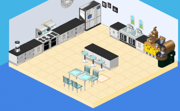
Simple, sweet – and caffeinated! Check out the coffee and espresso station!
Elwin’s Design (Option B):
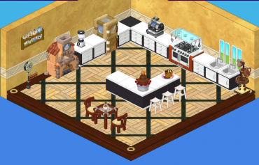
This kitchen makes good use of chocolate – and LOTS of it!
Wiggles’ Design (Option C):
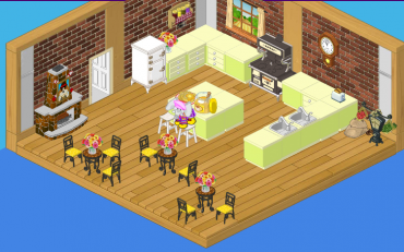
I had to check out the competition!
So…please help Fluffington choose his kitchen by telling him which design you like best!







choice 1
THE SECOND ONE ITS SOOOOOOO THE BEST!
I like option B!! Its so modern and sophisticated and fresh. its warm and cozy as well! i’d so make my kitchen like that if i could but i don’t have nearly enough money or items :( oh well at least i can still admire it :D
I like Elwins because of the chocalote fountain the floor and wall and the island.
I pick Choice A. It looks modern and nice. Choice B just looks like too much brown, and Choice C looks like a shop.
I LOVE Hailey’s! So modern, so neat, so airy! It was enough room for LOTS of friends to comfortably fit. I would pick it. I haven’t seen those chairs ever though, probably E-store. I wonder which one will win.
-CoolCat
Option A is the cleanest and most modern, but lacking in plants or decorative items.
Option B is colorful but more of a cafe.
Choice A!
i love a so organized my fav
I think that they should choose the first idea!!!!