Webkinz fans! Hailey here with a question for you: what would YOU do if you were given access to all of THE most beautiful things in Webkinz World and could use those beautiful things to make THE best kitchen ever?
Answer: you’d jump up and down and yell and cheer and high-five your twin brother and run around your house a little bit and then collapse in a chair and start sketching your ideas.
OK, so that’s what I did.
But still.
Anyway, what happened is this: yesterday Fluffington St. Bernard(THE Fluffington St. Bernard) called me and asked if Elwin and I would be willing to submit some ideas for his new kitchen makeover. He’s got Wiggles sending him a couple of designs, too.
So…that’s where YOU come into things: we need your help to figure out which design is best. Here are our favorite three – one from Elwin, one from Wiggles and one from me. Tell us in the comments which room you like best – and Fluffington will announce his preference next week!
Hailey’s Design (Option A):
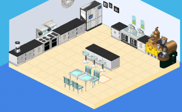
Simple, sweet – and caffeinated! Check out the coffee and espresso station!
Elwin’s Design (Option B):
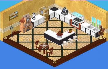
This kitchen makes good use of chocolate – and LOTS of it!
Wiggles’ Design (Option C):
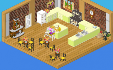
I had to check out the competition!
So…please help Fluffington choose his kitchen by telling him which design you like best!







I like option A and B the best. And I like option B the most, more than option A.
I think it is ok. Too much all along the wall and no windows. Webkinz really needs to make bigger windows.
Definitely option B! it has a homelike feeling to it. option A is too empty and blank and C looks more like a restaurant
All of them are really good but most likely A or C.
I like haileys the best, so modern
i like b!
option B, but with the floor of option C would make it perfect.
I LOVE WIGGLE’S DESIGN!!!!
C is the cutest but B has good a theme and color palette. 1 is worth the most but it’s cold and plain and the colorful counters with the espresso machine really stick out. I would pick one or two but I would change some things too. I love decorating!
I love option A. It is more sophisticated and would be a kitchen I would enjoy myself. Lots of room for friends and family.