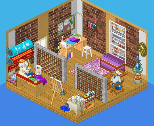
Day 1 – Hailey’s Studio
So Elwin and I have moved into our new studio space and we are so excited! We love designing so just imagine how much fun we’re having getting to design for ourselves!
Of course it’s ideal that the Creative Studio Theme we consulted on has just come out in the W Shop because I was able to put a lot of the pieces to good use when I designed my personal studio, where I can go and work on my own when I need to.
I decided to split up the room into two spaces. On one side I can discuss designs with clients and plan out my spaces, and on the other side I can sew and paint to my heart’s delight and not have to worry about clients seeing my mess. Because the creative process is not always pretty, my friends!
I found these awesome graffiti walls that went really well with the exposed brick in the wallpaper I chose. I think that along with some of the pieces of the Persian theme and the new Creative Studio theme and a few other quirky odds and ends I’ve created a really eclectic space that reflects my creativity.


u know what hailey, your room is o.k but i honestly do not love it, sorry.
Eh. It’s fine. I like how she divided her room and how she mixed and matched.I think it’s a bit too crowded though.
It is an okay room, but it isn’t my favorite design. A little too cluttered. But it is still cute.
It is a decent design, but the room is way to cluttered. I don’t know why they didn’t de-clutter it alot, like a simple desk, chairs, and a nice design with plants and windows and all sorts of decorations that keeps the room pretty and clean for a front room, with the messy stuff in the back. I don’t think they would get much designing business with a messy reception room like that.
I LOVE IT!!!!!!!!!!
COOL! but wish it was a bit bigger. :/