Our 3D artists have been hard at work, and today, I have your first look at part 1 of the new Trick or Treat Street room theme. This year’s Halloween theme will be available in the W Shop starting October 1st.
We have taken a lot of your suggestions into consideration when designing these final items, so I hope that you are happy with the way they turned out.
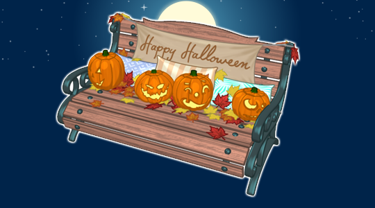
The bench looks very similar to the original concept drawing. The only real difference is that the pumpkins were made smaller and moved to the back of the bench so 2 pets could easily sit comfortably while taking a break from trick-or-treating:
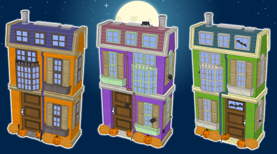
Here’s a look at those three Halloween homes. Several changes were made based on your feedback. The homes now have a slightly more modern look and the cobwebs were removed. There are also slight design differences to each home, like the position of the windows and doors. We also added different decorations to each house. How do you think they turned out?
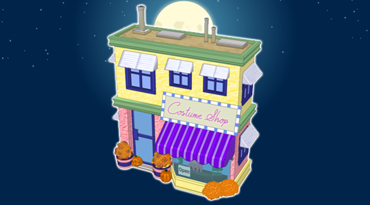
Finally, here’s a look at the costume shop. I think it matches the styles of the homes nicely. The best part about this building is that it will work as storage so you can keep your favorite Halloween costumes here!
Start saving your KinzCash now! This theme will only be available throughout October, so you’ll want to grab multiples of each item before they’re retired.
What do you think of this theme so far? Let us know by leaving a comment in the section below…





Not a fan of the store fronts with nowhere to go….enter the room, look around….same as the boring Christmas Carol theme
I LOVE the concept drawings of the houses. The actual ones are NOT Halloween! You seem to be able to rotate and create different looks…you should do that with the houses! One side Spooky, one side not!
Sadly I agree that the buildings are boring now. They need to look spooky and have the spider webs on them. I do love the bench. The houses are still way to similar and look cookie cutter instead of making one shorter with a pointy roof or something. So many of your past themes really felt like Halloween and this is almost too cute and needs more spook to it.
Right, totally boring.
Is this an outdoor theme or can it be used indoors?
LOVE all the pumpkins and leaves!
I actually liked the concept drawings better, I miss the cobwebs and the buildings don’t look spooky at all.
I liked the concept drawings better also.
This looks really fun! I’ll be really disappointed if everything turns out to be deluxe.
Ooh, cool! I gotta say, I really like the way that bench turned out! =] Great job, design team! ^-^ Although, about the houses… I think actually liked the concept art a little better, ahah ‘^^ Sorry! =( I know many may disagree with me, but I actually wish they had kept the cobwebs, and that the houses were less modern. I preferred when they were spookier and looked more antiquated. Granted, I know the “modern”, “less spooky” look will allow the buildings to be used for other things, but this is a Halloween theme, after all… that was it’s intention, yeah? I just don’t feel like it’s as Halloween-y as it was before. When I think of Halloween, I think of old and dusty and cobweb-covered things, not bright-colored, look-alike houses with a couple of pumpkins in the window. (The colors are a bit garish in my opinion, too– I much preferred the darker hues. Then again, maybe I’m biased because I don’t like modern, everything-has-to-look-the-same houses :P I actually kind of despise those in real life XD I like variety!) Ah well… welp, I do look forward to seeing what the other pieces look like! I hope you guys keep the rest of the pieces nice and spooky! >^^<
Yes TaffyKitty12, you’ve hit the nail completely on the head. Darker hues and older looking houses. Halloween is all about the spooky and scary and these are too modern and cutsie!
Make a Haunted House!